
In statistics, data binning is a way to categorize a number of continuous values into a smaller number of buckets (bins). Each bucket defines an numerical interval. For example, if there is a variable about house-based education levels which are measured by continuous values ranged between 0 and 19, data binning will place each value into one bucket if the value falls into the interval that the bucket covers. This post shows data binning in R as well as visualizing the bins.
The dataset contains 32038 observations for mean education level per house. Load the data into R.
data <- read.csv("data/meaneducation.csv")
x <- data[,1] #take 1st column of data frame to a vector
After loading the data, inspect the data by running
summary(x)
   Min. 1st Qu.  Median    Mean 3rd Qu.    Max.
   0.00   11.88   12.43   12.52   13.10   19.00
The summary data shows the range of the variable, [0,19][0,19]. The median education level per house is 12.4312.43
As the attribute is continuous, the data distribution can be visualized in a probability distribution graph. The following script creates a density plot showing the probability distribution of x.
library(ggplot2)
ggplot(data=data, aes(x=data[,1])) +
  geom_density(fill='lightblue') +
  geom_rug() +
  labs(x='mean education per house')

While the density plot is informative, it might be too technical for less technical people to read. In this case, the better data visualization is binning the data into discrete categories and plotting the count of each bin. A sample script is provided below for creating bins and plot bin counts in a bar chart.
Creating bins
# set up boundaries for intervals/bins
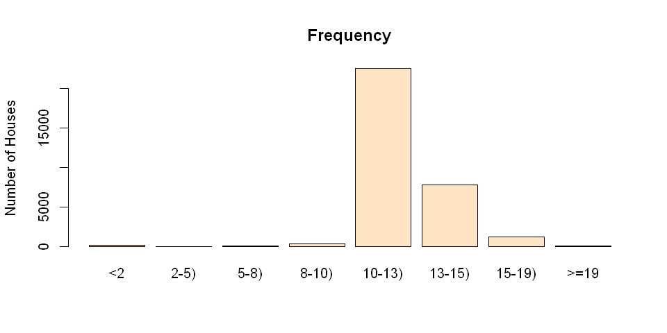
breaks <- c(0,2,5,8,10,13,15,19,21)
# specify interval/bin labels
labels <- c("<2", "2-5)", "5-8)", "8-10)", "10-13)", "13-15)", "15-19)", ">=19")
# bucketing data points into bins
bins <- cut(x, breaks, include.lowest = T, right=FALSE, labels=labels)
# inspect bins
summary(bins)
    <2   2-5)   5-8)  8-10) 10-13) 13-15) 15-19)    19-
   120      0     24    330  22595   7760   1200      9
The script above results in a factor bins with 8 levels. Each level is marked by a string in the vector labels. Each value in bins indicates the level that the observation falls into. The summary of bins lists the count for each bin.
Plotting the bins
After generating the bins, simply plot the bins by the following script:
plot(bins, main="Frequency", ylab="Number of Houses",col="bisque")
Using ggplot
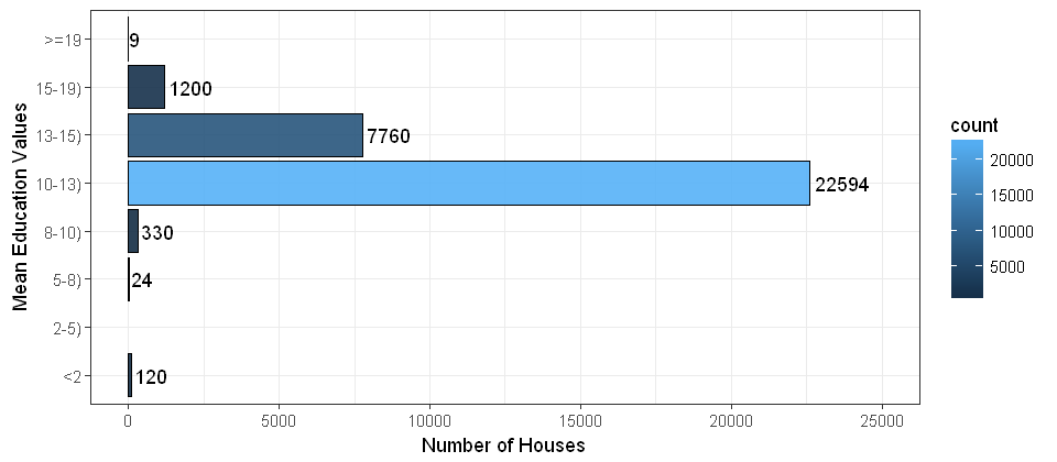
y <- cbind(data, bins)
ggplot(data=y, aes(x=y$bins,fill=..count..)) +
  geom_bar(color='black', alpha=0.9) +
  stat_count(geom="text", aes(label=..count..), hjust=-0.1) +
  theme_bw() +
  labs(y="Number of Houses",x="Mean Education Values") +
  coord_flip() +
  ylim(0,25000) +
  scale_x_discrete(drop=FALSE) # include the bins of length zero
Recent Comments