Next generation sequencing (NGS) technology allows laboratories to investigate virome composition in clinical and environmental samples in a culture-independent way. There is a need for bioinformatic tools capable of parallel processing of virome sequencing data by exactly identical methods: this is especially important in studies of multifactorial diseases, or in parallel comparison of laboratory protocols.
Utilities / Create consensus sequence from a BAM file
Description
Given an indexed BAM file and corresponding reference genome (in fasta format), this tool constructs a consensus sequence based on the alignment.
Parameters
None
Details
This tool uses SAMtools, bcftools and vcfutils.pl script to create a consensus sequence for the given alignment file. The actual command line executed is:
Note that the input BAM file must be sorted before it can be used by this tool.
Output
Output is a fasta formatted sequence file.
References
This tool is based on the SAMtools package. Please cite the article The Sequence alignment/map (SAM) format and SAMtools by Li H., Handsaker B., Wysoker A., Fennell T., Ruan J., Homer N., Marth G., Abecasis G., Durbin R. and 1000 Genome Project Data Processing Subgroup (2009) Bioinformatics, 25, 2078-9. [PMID: 19505943].
The following content is mostly compiled (with some original additions on my side) from the material that can be found athttp://www.sthda.com/, as well as in the vignette for the corrplot R package – An Introduction to corrplot Package. The sole purpose of this text is to put all the info into one document in an easy to search format. Since I’m a huge fan of Hadley Wickham’s work I’ll insist on solutions based in “tidyverse” whenewer possible…
Install and load required R packages
We’ll use the ggpubr R package for an easy ggplot2-based data visualization, corrplot package to plot correlograms, Hmisc to calculate correlation matrices containing both cor. coefs. and p-values,corrplot for plotting correlograms, and of course tidyverse for all the data wrangling, plotting and alike:
There are different methods to perform correlation analysis:
Pearson correlation (r), which measures a linear dependence between two variables (x and y). It’s also known as a parametric correlation test because it depends to the distribution of the data. It can be used only when x and y are from normal distribution. The plot of y = f(x) is named the linear regression curve.
Kendall ττ and Spearman ρρ, which are rank-based correlation coefficients (non-parametric)
The most commonly used method is the Pearson correlation method
Compute correlation in R
R functions
Correlation coefficients can be computed in R by using the functions cor() and cor.test():
cor() computes the correlation coefficient
cor.test() test for association/correlation between paired samples. It returns both the correlation coefficient and the significance level(or p-value) of the correlation.
The simplified formats are:
cor(x, y, method=c("pearson", "kendall", "spearman"))cor.test(x, y, method=c("pearson", "kendall", "spearman"))
where:
x, y: numeric vectors with the same length
method: correlation method
If the data contain missing values, the following R code can be used to handle missing values by case-wise deletion:
cor(x, y, method="pearson", use="complete.obs")
Preliminary considerations
We’ll use the well known built-in mtcars R dataset.
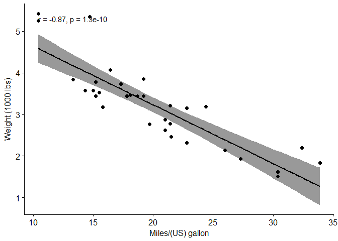
Is the relation between variables linear? Yes, from the plot above, the relationship can be, closely enough, modeled as linear. In the situation where the scatter plots show curved patterns, we are dealing with nonlinear association between the two variables.
Are the data from each of the 2 variables (x, y) following a normal distribution?
Use Shapiro-Wilk normality test →→ R function: shapiro.test()
and look at the normality plot →→ R function: ggpubr::ggqqplot()
Shapiro-Wilk test can be performed as follow:
Null hypothesis: the data are normally distributed
Alternative hypothesis: the data are not normally distributed
# Shapiro-Wilk normality test for mpgshapiro.test(my_data$mpg)# => p = 0.1229
##
##  Shapiro-Wilk normality test
##
## data:  my_data$mpg
## W = 0.94756, p-value = 0.1229
# Shapiro-Wilk normality test for wtshapiro.test(my_data$wt)# => p = 0.09
##
##  Shapiro-Wilk normality test
##
## data:  my_data$wt
## W = 0.94326, p-value = 0.09265
As can be seen from the output, the two p-values are greater than the predetermined significance level of 0.05 implying that the distribution of the data are not significantly different from normal distribution. In other words, we can assume the normality.
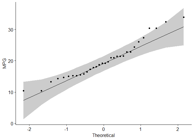
One more option for checking the normality of the data distribution is visual inspection of the Q-Q plots (quantile-quantile plots). Q-Q plot draws the correlation between a given sample and the theoretical normal distribution.
Again, we’ll use the ggpubr R package to obtain “pretty”, i.e. publishing-ready, Q-Q plots.
library("ggpubr")# Check for the normality of "mpg""ggqqplot(my_data$mpg, ylab="MPG")
# Check for the normality of "wt""ggqqplot(my_data$wt, ylab="WT")
From the Q-Q normality plots, we can assume that both samples may come from populations that, closely enough, follow normal distributions.
It is important to note that if the data does not follow the normal distribution, at least closely enough, it’s recommended to use the non-parametric correlation, including Spearman and Kendall rank-based correlation tests.
##
##  Pearson's product-moment correlation
##
## data:  my_data$wt and my_data$mpg
## t = -9.559, df = 30, p-value = 1.294e-10
## alternative hypothesis: true correlation is not equal to 0
## 95 percent confidence interval:
##  -0.9338264 -0.7440872
## sample estimates:
##        cor
## -0.8676594
So what’s happening here? First of all let’s clarify the meaning of this printout:
t is the t-test statistic value (t = -9.559),
df is the degrees of freedom (df= 30),
p-value is the significance level of the t-test(p-value =1.29410−101.29410−10).
conf.int is the confidence interval of the correlation coefficient at 95% (conf.int = [-0.9338, -0.7441]);
sample estimates is the correlation coefficient(Cor.coeff = -0.87).
Interpretation of the results: As can be see from the results above the p-value of the test is 1.29410−101.29410−10, which is less than the significance levelα=0.05α=0.05. We can conclude that wt and mpg are significantly correlated with a correlation coefficient of -0.87 and p-value of 1.29410−101.29410−10.
Access to the values returned by cor.test() function
The function cor.test() returns a list containing the following components:
str(res)
## List of 9
##  $ statistic  : Named num -9.56
##   ..- attr(*, "names")= chr "t"
##  $ parameter  : Named int 30
##   ..- attr(*, "names")= chr "df"
##  $ p.value    : num 1.29e-10
##  $ estimate   : Named num -0.868
##   ..- attr(*, "names")= chr "cor"
##  $ null.value : Named num 0
##   ..- attr(*, "names")= chr "correlation"
##  $ alternative: chr "two.sided"
##  $ method     : chr "Pearson's product-moment correlation"
##  $ data.name  : chr "my_data$wt and my_data$mpg"
##  $ conf.int   : atomic [1:2] -0.934 -0.744
##   ..- attr(*, "conf.level")= num 0.95
##  - attr(*, "class")= chr "htest"
Of these we are most interested with:
p.value: the p-value of the test
estimate: the correlation coefficient
# Extract the p.valueres$p.value
## [1] 1.293959e-10
# Extract the correlation coefficientres$estimate
##        cor
## -0.8676594
Kendall rank correlation test
The Kendall rank correlation coefficient or Kendall’s ττ statistic is used to estimate a rank-based measure of association. This test may be used if the data do not necessarily come from a bivariate normal distribution.
## Warning in cor.test.default(my_data$mpg, my_data$wt, method = "kendall"):
## Cannot compute exact p-value with ties
res2
##
##  Kendall's rank correlation tau
##
## data:  my_data$mpg and my_data$wt
## z = -5.7981, p-value = 6.706e-09
## alternative hypothesis: true tau is not equal to 0
## sample estimates:
##        tau
## -0.7278321
Here tau is the Kendall correlation coefficient, so The correlation coefficient between mpg and wy is -0.7278 and the p-value is 6.70610−96.70610−9.
Spearman rank correlation coefficient
Spearman’s ρρ statistic is also used to estimate a rank-based measure of association. This test may be used if the data do not come from a bivariate normal distribution.
## Warning in cor.test.default(my_data$wt, my_data$mpg, method = "spearman"):
## Cannot compute exact p-value with ties
res3
##
##  Spearman's rank correlation rho
##
## data:  my_data$wt and my_data$mpg
## S = 10292, p-value = 1.488e-11
## alternative hypothesis: true rho is not equal to 0
## sample estimates:
##       rho
## -0.886422
Here, rho is the Spearman’s correlation coefficient, so the correlation coefficient between mpg and wt is -0.8864 and the p-value is 1.48810−111.48810−11.
How to interpret correlation coefficient
Value of the correlation coefficient can vary between -1 and 1:
-1 indicates a strong negative correlation : this means that every time x increases, y decreases
0 means that there is no association between the two variables (x and y)
1 indicates a strong positive correlation : this means that y increases with x
What is a correlation matrix?
Previously, we described how to perform correlation test between two variables. In the following sections we’ll see how a correlation matrix can be computed and visualized. The correlation matrix is used to investigate the dependence between multiple variables at the same time. The result is a table containing the correlation coefficients between each variable and the others.
Compute correlation matrix in R
We have already mentioned the cor() function, at the intoductory part of this document dealing with the correlation test for a bivariate case. It be used to compute a correlation matrix. A simplified format of the function is :
method: indicates the correlation coefficient to be computed. The default is “pearson”” correlation coefficient which measures the linear dependence between two variables. As already explained “kendall” and “spearman” correlation methods are non-parametric rank-based correlation tests.
If your data contain missing values, the following R code can be used to handle missing values by case-wise deletion:
Unfortunately, the function cor() returns only the correlation coefficients between variables. In the next section, we will use Hmisc R package to calculate the correlation p-values.
Correlation matrix with significance levels (p-value)
The function rcorr() (in Hmisc package) can be used to compute the significance levels for pearson and spearman correlations. It returns both the correlation coefficients and the p-value of the correlation for all possible pairs of columns in the data table.
Simplified format:
rcorr(x, type=c("pearson","spearman"))
x should be a matrix. The correlation type can be either pearson or spearman.
Custom function for convinient formatting of the correlation matrix
This section provides a simple function for formatting a correlation matrix into a table with 4 columns containing :
Column 1 : row names (variable 1 for the correlation test)
Column 2 : column names (variable 2 for the correlation test)
Column 3 : the correlation coefficients
Column 4 : the p-values of the correlations
flat_cor_mat<-function(cor_r, cor_p){#This function provides a simple formatting of a correlation matrix#into a table with 4 columns containing :# Column 1 : row names (variable 1 for the correlation test)# Column 2 : column names (variable 2 for the correlation test)# Column 3 : the correlation coefficients# Column 4 : the p-values of the correlationslibrary(tidyr)library(tibble)cor_r<-rownames_to_column(as.data.frame(cor_r), var="row")cor_r<-gather(cor_r, column, cor, -1)cor_p<-rownames_to_column(as.data.frame(cor_p), var="row")cor_p<-gather(cor_p, column, p, -1)cor_p_matrix<-left_join(cor_r, cor_p, by=c("row", "column"))cor_p_matrix}cor_3<-rcorr(as.matrix(mtcars[, 1:7]))my_cor_matrix<-flat_cor_mat(cor_3$r, cor_3$P)head(my_cor_matrix)
There are several different ways for visualizing a correlation matrix in R software:
symnum() function
corrplot() function to plot a correlogram
scatter plots
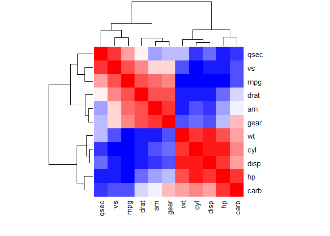
heatmap
We’ll run trough all of these, and then go a bit more into deatil with correlograms.
Use symnum() function: Symbolic number coding
The R function symnum() is used to symbolically encode a given numeric or logical vector or array. It is particularly useful for visualization of structured matrices, e.g., correlation, sparse, or logical ones. In the case of a correlatino matrix it replaces correlation coefficients by symbols according to the level of the correlation.
cutpoints: correlation coefficient cutpoints. The correlation coefficients between 0 and 0.3 are replaced by a space (” “); correlation coefficients between 0.3 and 0.6 are replaced by”.“; etc .
symbols: the symbols to use.
abbr.colnames: logical value. If TRUE, colnames are abbreviated.
*As indicated in the legend, the correlation coefficients between 0 and 0.3 are replaced by a space (” “); correlation coefficients between 0.3 and 0.6 are replace by”.“; etc .*
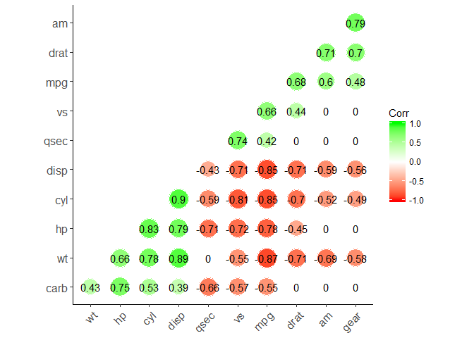
Use the corrplot() function: Draw a correlogram
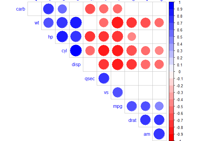
The function corrplot(), in the package of the same name, creates a graphical display of a correlation matrix, highlighting the most correlated variables in a data table.
In this plot, correlation coefficients are colored according to the value. Correlation matrix can be also reordered according to the degree of association between variables.
The simplified format of the function is:
corrplot(corr, method="circle")
Here:
corr: the correlation matrix to be visualized
method: The visualization method to be used, there are seven different options: “circle”, “square”, “ellipse”, “number”, “shade”, “color”, “pie”.
There are three general types of a correlogram layout :
“full” (default) : display full correlation matrix
“upper”: display upper triangular of the correlation matrix
“lower”: display lower triangular of the correlation matrix
Examples:
# upper triangularcorrplot(M, type="upper")
#lower triangularcorrplot(M, type="lower")
Reordering the correlation matrix
The correlation matrix can be reordered according to the correlation coefficient. This is important to identify the hidden structure and pattern in the matrix. Use order = "hclust" argument for hierarchical clustering of correlation coefficients.
Example:
# correlogram with hclust reorderingcorrplot(M, order="hclust")
# or exploit the symetry of the correlation matrix # correlogram with hclust reorderingcorrplot(M, type="upper", order="hclust")
Changing the color and direction of text labels in the correlogram
Examples:
# Change background color to lightgreen and color of the circles to darkorange and steel bluecorrplot(M, type="upper", order="hclust", col=c("darkorange", "steelblue"),
bg="lightgreen")
# use "colorRampPallete" to obtain contionus color scalescol<-colorRampPalette(c("darkorange", "white", "steelblue"))(20)corrplot(M, type="upper", order="hclust", col=col)
# Or use "RColorBrewer" packagelibrary(RColorBrewer)corrplot(M, type="upper", order="hclust",
col=brewer.pal(n=9, name="PuOr"), bg="darkgreen")
Use the tl.col argument for defining the text label color and tl.srt for text label string rotation.
# Mark the insignificant coefficients according to the specified p-value significance levelcor_5<-rcorr(as.matrix(mtcars))M<-cor_5$rp_mat<-cor_5$Pcorrplot(M, type="upper", order="hclust",
p.mat=p_mat, sig.level=0.01)
# Leave blank on no significant coefficientcorrplot(M, type="upper", order="hclust",
p.mat=p_mat, sig.level=0.05, insig="blank")
Fine tuning customization of the correlogram
col<-colorRampPalette(c("#BB4444", "#EE9988", "#FFFFFF", "#77AADD", "#4477AA"))corrplot(M, method="color", col=col(200),
type="upper", order="hclust",
addCoef.col="black", # Add coefficient of correlationtl.col="darkblue", tl.srt=45, #Text label color and rotation# Combine with significance levelp.mat=p_mat, sig.level=0.01,
# hide correlation coefficient on the principal diagonaldiag=FALSE)
I’d say this is more than enough for introductory exploration of correlograms. More information can be found in the, already mentioned, vignette for the corrplot R package – An Introduction to corrplot Package
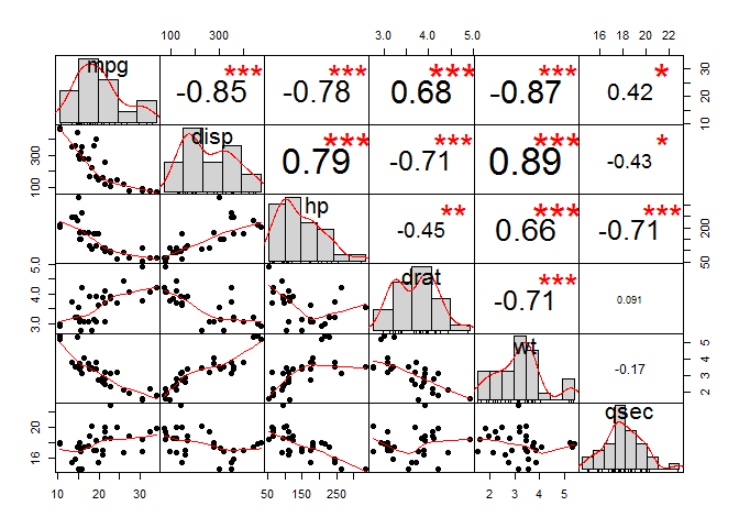
Use chart.Correlation(): Draw scatter plots
The function chart.Correlation() from the package “PerformanceAnalytics”, can be used to display a chart of a correlation matrix. This is a very convinient way of exploring multivariate correlations.
library("PerformanceAnalytics")
## Loading required package: xts
## Loading required package: zoo
##
## Attaching package: 'zoo'
## The following objects are masked from 'package:base':
##
##     as.Date, as.Date.numeric
##
## Attaching package: 'xts'
## The following objects are masked from 'package:dplyr':
##
##     first, last
##
## Attaching package: 'PerformanceAnalytics'
## The following object is masked from 'package:graphics':
##
##     legend
Correlation coefficient is a quantity that measures the strength of the association (or dependence) between two or more variables.
Types of correlation coefficient
Pearson r: is a parametric correlation test as it depends on the distribution (normal distribution) of the data. It measures the linear dependence between two variables. The plot of y = f(x) is named the linear regression curve. (the mostly used method)
Kendall tau: rank-based correlation coefficient (non-parametric methods). Recommended if the data do not come from a bivariate normal distribution.
Spearman rho: rank-base correlation coefficient (non-parametric methods). Recommended if the data do not come from a bivariate normal distribution.
Correlation formula
In the formula below,
$x$ and $y$ are two vectors of length $n$ $m_y$ and $m_y$ corresponds to the means of $x$ and $y$, respectively.
Pearson correlation formula
The p-value (significance level) of the correlation can be determined :
by using the correlation coefficient table for the degrees of freedom : $df=n-2$, where $n$ is the number of observation in x and y variables.
or by calculating the t value as follow: In the case 2) the corresponding p-value is determined using t distribution table for $df=n-2$
If the p-value is < 5%, then the correlation between x and y is significant.
Spearman correlation formula
The Spearman correlation method computes the correlation between the rank of $x$ and the rank of $y$ variables.
Where $x’ = rank(x_)$ and $y’ = rank(y_)$.
Kendall correlation formula
The Kendall correlation method measures the correspondence between the ranking of x and y variables. The total number of possible pairings of x with y observations is $n(n???1)/2$, where n is the size of x and y.
The procedure is as follow:
Begin by ordering the pairs by the x values. If x and y are correlated, then they would have the same relative rank orders.
Now, for each $y_i$, count the number of $y_j > y_i$ (concordant pairs (c)) and the number of $y_j < y_i$ (discordant pairs (d)).
Kendall correlation distance is defined as follow:
Where, $n_c$: total number of concordant pairs $n_d$: total number of discordant pairs $n$: size of x and y
Calculate correlation coefficient
Correlation coefficient can be computed using the functions cor() or cor.test():
cor(x, y, method = c("pearson", "kendall", "spearman"), use = "complete.obs")
cor.test(x, y, method=c("pearson", "kendall", "spearman"), use = "complete.obs")

x and y are two numeric vectors with the same length
cor() computes the correlation coefficient
cor.test() test for association/correlation between paired samples. It returns both the correlation coefficient and the significance level(or p-value) of the correlation.
use = "complete.obs" handle missing values by case-wise deletion
Preleminary test to check the test assumptions
data are normally distributed
Is the covariation linear? Yes, form the plot, the relationship is linear. In the situation where the scatter plots show curved patterns, we are dealing with nonlinear association between the two variables.
Are the data from each of the 2 variables (x, y) follow a normal distribution?
Use Shapiro-Wilk normality test -> R function: shapiro.test() and look at the normality plot -> R function: ggpubr::ggqqplot()
Shapiro-Wilk test can be performed as follow:
Null hypothesis: the data are normally distributed
Alternative hypothesis: the data are not normally distributed
#Shapiro-Wilk normality test for mpg and wtshapiro.test(mtcars$mpg)
##
## 	Shapiro-Wilk normality test
##
## data:  mtcars$mpg
## W = 0.94756, p-value = 0.1229
shapiro.test(mtcars$wt)
##
## 	Shapiro-Wilk normality test
##
## data:  mtcars$wt
## W = 0.94326, p-value = 0.09265
#Visual inspection of the data normality using Q-Q plots (quantile-quantile plots)#Q-Q plot draws the correlation between a given sample and the normal distribution.ggqqplot(mtcars$mpg,ylab="MPG")
##
## 	Pearson's product-moment correlation
##
## data:  mtcars$wt and mtcars$mpg
## t = -9.559, df = 30, p-value = 1.294e-10
## alternative hypothesis: true correlation is not equal to 0
## 95 percent confidence interval:
##  -0.9338264 -0.7440872
## sample estimates:
##        cor
## -0.8676594
data are not normally distributed
If the data are not normally distributed, it’s recommended to use the non-parametric correlation, including Spearman and Kendall rank-based correlation tests.
## Warning in cor.test.default(mtcars$wt, mtcars$mpg, method = "kendall"):
## Cannot compute exact p-value with ties
#Extract the p.value and the correlation coefficientres$p.value
## [1] 6.70577e-09
res$estimate
##        tau
## -0.7278321
Interprete correlation coefficient
The value of correlation coefficient can be negative or positive, range [-1, 1]:
-1: strong negative correlation
0: no relationship between the two variables (x and y)
1: strong positive correlation
Generate correlation matrix
Function rcorr from Hmisc package used to return correlation coefficients and the correlation p-values, function ggcorrplot from ggcorrplot used to visualize correlation matrix.
Method one: calculate matrix manually
Method two: function ggcorr() in ggally package. However, can’t reorder matrix and display significance level.
Method three: corrplot() function from corrplot package can be used
Method four: ggcorrplot() function from ggcorrplot package. Functions: reordering, displays significance level, computing a matrix of correlation p-values.
cor() return correlation matrix; cor_pmat() in ggcorrplot package computes a matrix of correlation p-values.
corr<-round(cor(mtcars),2)#Compute a correlation matrixp.mat<-cor_pmat(mtcars)#Compute a matrix of correlation p-values
Method two: use rcorr()
The function rcorr() [in Hmisc package] returns both the correlation coefficients and the correlation p-values for all possible pairs of columns in the data table.
rcorr(x, type = c("pearson","spearman"))

The output is a list containing the following elements:
r: the correlation matrix
n: the matrix of the number of observations used in analyzing each pair of variables
P: the p-values corresponding to the significance levels of correlations.
cor() can be used to compute a correlation matrix, but not correlation p-values
cor(x, method = c("pearson", "kendall", "spearman"), use = "complete.obs")
x: numeric matrix or a data frame.
method: indicates the correlation coefficient to be computed.
  - pearson(default): measures the linear dependence between two variables.
  - kendall: non-parametric rank-based correlation test.
  - spearman: non-parametric rank-based correlation test.
use = "complete.obs": case-wise deletion, which is useful for NA-containing matrix.
Computing the p-value of correlations
P value calculation principle
# mat : is a matrix of data
# ... : further arguments to pass to the native R cor.test function
cor.mtest <- function(mat, ...) {
    mat <- as.matrix(mat)
    n <- ncol(mat)
    p.mat<- matrix(NA, n, n)
    diag(p.mat) <- 0
    for (i in 1:(n - 1)) {
        for (j in (i + 1):n) {
            tmp <- cor.test(mat[, i], mat[, j], ...)
            p.mat[i, j] <- p.mat[j, i] <- tmp$p.value
        }
    }
  colnames(p.mat) <- rownames(p.mat) <- colnames(mat)
  p.mat
}

#matrix of the p-value of the correlation
p.mat <- cor.mtest(mtcars)
Format the correlation matrix (unnecessary)
### flattenCorrMatrix function#cormat: matrix of the correlation coefficients#pmat: matrix of the correlation p-valuesflattenCorrMatrix<-function(cormat,pmat){ut<-upper.tri(cormat)data.frame(row=rownames(cormat)[row(cormat)[ut]],column=rownames(cormat)[col(cormat)[ut]],cor=(cormat)[ut],p=pmat[ut])}#head(flattenCorrMatrix(corr$r, corr$P))
Visualize correlation matrix
Five different ways to visualize a correlation matrix:
symnum() function (gave up, too lazy to introduce)
corrplot() function to plot a correlogram
scatter plots
heatmap
ggcorrplot function (recommend)
corrplot() function to plot a correlogram
R corrplot function is used to plot the graph of the correlation matrix.
corrplot(corr, method="circle", type="upper", order="hclust", col=col, bg="lightblue", tl.col="black", tl.srt=45, )

corr:	The correlation matrix to visualize. To visualize a general matrix, please use is.corr=FALSE.
method:	seven visualization method: "circle", "square"", "ellipse", number", "shade"", "color", "pie"
type: types of layout.
  - "full" (default): display full correlation matrix
  - "upper": display upper triangular of the correlation matrix
  - "lower": display lower triangular of the correlation matrix
order: reorder the correlation matrix. The correlation matrix can be reordered according to the correlation coefficient. This is important to identify the hidden structure and pattern in the matrix.
  - "hclust": for hierarchical clustering order
tl.col: for text label color, used to change text colors
tl.srt: for text label string rotation. used to change label rotations.
library(RColorBrewer)col<-colorRampPalette(c("red","white","blue"))(20)corrplot(corr,method="circle",#visualization methodtype="upper",#types of layoutorder="hclust",#order: reorder the correlation matrixcol=col,#col: Using different color spectrum#bg="lightblue", #bg: Change background color to lightblue#col=brewer.pal(n=8, name="RdBu") #use RcolorBrewer palette of colors#col=brewer.pal(n=8, name="RdYlBu") #use RcolorBrewer palette of colors#col=brewer.pal(n=8, name="PuOr") #use RcolorBrewer palette of colorstl.col="blue",#change text colorstl.srt=45,#change label rotations#Combine with significancep.mat=p.mat,#add the matrix of p-valuesig.level=0.01,## Specialized the insignificant value according to the significant levelinsig="blank",#Leave blank on no significant coefficientdiag=FALSE#hide correlation coefficient on the principal diagonal)
chart.Correlation(): Draw scatter plots
chart.Correlation() in package PerformanceAnalytics can be used to display a chart of a correlation matrix.
#The distribution of each variable is shown on the diagonal.#left bottom of the diagonal: the bivariate scatter plots with a fitted line are displayed#right top of the diagonal: the value of the correlation plus the significance level as stars#Each significance level is associated to a symbol: #p-values(0, 0.001, 0.01, 0.05, 0.1, 1) <=> symbols(***, **, *, ., ,"")
#x: the correlation matrix to be plotted#col: color palettes#symm: logical indicating if x should be treated symmetrically; can only be true when x is a square matrix.
ggcorrplot function (recommend)
ggcorrplot(corr,method="circle",#"square" (default), "circle" type="lower",# "full" (default), "lower" or "upper" display.hc.order=TRUE,#logical value. If TRUE, correlation matrix will be hc.ordered using hclust function.outline.col="white",#the outline color of square or circle. Default "gray"ggtheme=ggplot2::theme_classic,#Change themecolors=c("red","white","green"),#Change colorslab=TRUE,#Add correlation coefficientssig.level=0.05,#set significant levelp.mat=p.mat,#Add correlation significance levelinsig="blank"#Leave blank on no significant coefficient)
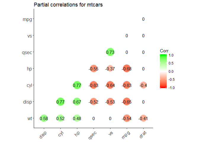
Partial correlation
The R package ppcor provides users with four functions: pcor(), pcor.test(), spcor(), and spcor.test(). pcor() calculates the partial correlations of all pairs of two random variables of a matrix or a data frame and provides the matrices of statistics and p-values of each pairwise partial correlation. pcor.test() computes the pairwise partial correlation coefficient of a pair of two random variables given one or more random variables.
# install.packages("ppcor")library(ppcor)
# calculate the correlations between each pair with all other variables are adjusted partial.corr<-pcor(x=mtcars,method="spearman")#Results interpretation: ?pcor()# calculate the correlations between each pair with specified variables are adjusted partial_correlation<-function(df){n<-ncol(df)results<-list()# define an empty listresults[["estimate"]]<-sapply(1:(n-3),function(x){sapply(1:(n-3),function(y){ifelse(x==y,1,pcor.test(df[,x],df[,y],df[,c((n-2):n)],method="spearman")$estimate)})})results[["p.value"]]<-sapply(1:(n-3),function(x){sapply(1:(n-3),function(y){ifelse(x==y,0,pcor.test(df[,x],df[,y],df[,c((n-2):n)],method="spearman")$p.value)})})colnames(results[["estimate"]])<-rownames(results[["estimate"]])<-colnames(df[,c(1:(n-3))])colnames(results[["p.value"]])<-rownames(results[["p.value"]])<-colnames(df[,c(1:(n-3))])return(results)}pcor<-partial_correlation(mtcars)library(ggcorrplot)ggcorrplot(pcor$estimate,method="circle",#"square" (default), "circle"type="lower",# "full" (default), "lower" or "upper" display.hc.order=TRUE,#logical value. If TRUE, correlation matrix will be hc.ordered using hclust function.outline.col="white",#the outline color of square or circle. Default "gray"ggtheme=ggplot2::theme_classic,#Change themecolors=c("red","white","green"),#Change colorslab=TRUE,#Add correlation coefficientssig.level=0.05,#set significant levelp.mat=pcor$p.value,#Add correlation significance levelinsig="blank",#Leave blank on no significant coefficienttitle="Partial correlations for mtcars")
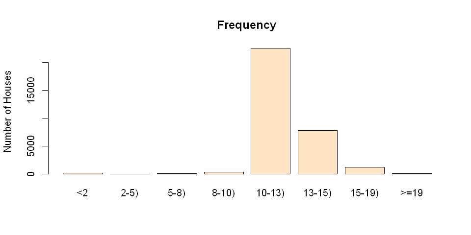
In statistics, data binning is a way to categorize a number of continuous values into a smaller number of buckets (bins). Each bucket defines an numerical interval. For example, if there is a variable about house-based education levels which are measured by continuous values ranged between 0 and 19, data binning will place each value into one bucket if the value falls into the interval that the bucket covers. This post shows data binning in R as well as visualizing the bins.
The dataset contains 32038 observations for mean education level per house. Load the data into R.
data<-read.csv("data/meaneducation.csv")x<-data[,1]#take 1st column of data frame to a vector
After loading the data, inspect the data by running
summary(x)
   Min. 1st Qu.  Median    Mean 3rd Qu.    Max.
   0.00   11.88   12.43   12.52   13.10   19.00
The summary data shows the range of the variable, [0,19][0,19]. The median education level per house is 12.4312.43
As the attribute is continuous, the data distribution can be visualized in a probability distribution graph. The following script creates a density plot showing the probability distribution of x.
library(ggplot2)ggplot(data=data,aes(x=data[,1]))+geom_density(fill='lightblue')+geom_rug()+labs(x='mean education per house')
While the density plot is informative, it might be too technical for less technical people to read. In this case, the better data visualization is binning the data into discrete categories and plotting the count of each bin. A sample script is provided below for creating bins and plot bin counts in a bar chart.
Creating bins
# set up boundaries for intervals/bins
breaks<-c(0,2,5,8,10,13,15,19,21)# specify interval/bin labels
labels<-c("<2","2-5)","5-8)","8-10)","10-13)","13-15)","15-19)",">=19")# bucketing data points into bins
bins<-cut(x,breaks,include.lowest=T,right=FALSE,labels=labels)# inspect bins
summary(bins)
The script above results in a factor bins with 8 levels. Each level is marked by a string in the vector labels. Each value in bins indicates the level that the observation falls into. The summary of bins lists the count for each bin.
Plotting the bins
After generating the bins, simply plot the bins by the following script:
plot(bins,main="Frequency",ylab="Number of Houses",col="bisque")
Using ggplot
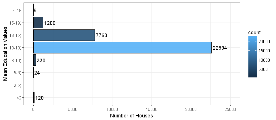
y<-cbind(data,bins)ggplot(data=y,aes(x=y$bins,fill=..count..))+geom_bar(color='black',alpha=0.9)+stat_count(geom="text",aes(label=..count..),hjust=-0.1)+theme_bw()+labs(y="Number of Houses",x="Mean Education Values")+coord_flip()+ylim(0,25000)+scale_x_discrete(drop=FALSE)# include the bins of length zero


Recent Comments