Metagenomics standard operating procedure v2

http://www.360doc.com/content/20/0823/10/71250389_931761136.shtml

https://github.com/LangilleLab/microbiome_helper/wiki/Metagenomics-standard-operating-procedure-v2

Note that this workflow is continually being updated. If you want to use the below commands be sure to keep track of them locally.

Last updated: 9 Oct 2018 (see revisions above for earlier minor versions and Metagenomics SOPs on the SOP for earlier major versions)

Important points to keep in mind:

  • The below options are not necessarily best for your data; it is important to explore different options, especially at the read quality filtering stage.
  • If you are confused about a particular step be sure to check out the pages under Metagenomic Resources on the right side-bar.
  • You should check that only the FASTQs of interest are being specified at each step (e.g. with the ls command). If you are re-running commands multiple times or using optional steps the input filenames and/or folders could differ.
  • The tool parallel comes up several times in this workflow. Be sure to check out our tutorial on this tool here.
  • You can always run parallel with the --dry-run option to see what commands are being run to double-check they are doing what you want!

This workflow starts with raw paired-end MiSeq or NextSeq data in demultiplexed FASTQ format assumed to be located within a folder called raw_data.

1. First Steps

1.1 Join lanes together (all Illumina, except MiSeq)

Concatenate multiple lanes of sequencing together (e.g. for NextSeq data). If you do NOT do this step, remember to change cat_lanes to raw_data in the further commands below that have assumed you are working with the most common type of metagenome data.

concat_lanes.pl raw_data/* -o cat_lanes -p 4

1.2 Inspect read quality

Run fastqc to allow manual inspection of the quality of sequences.

mkdir fastqc_out
fastqc -t 4 cat_lanes/* -o fastqc_out/

1.3 (Optional) Stitch F+R reads

Stitch paired-end reads together (summary of stitching results are written to “pear_summary_log.txt”). Note: it is important to check the % of reads assembled. It may be better to concatenate the forward and reverse reads together if the assembly % is too low (see step 2.2).

run_pear.pl -p 4 -o stitched_reads cat_lanes/*

If you don’t stitch your reads together at this step you will need to unzip your FASTQ files before continuing with the below commands.

2. Read Quality-Control and Contaminant Screens

2.1 Running KneadData

Use kneaddata to run pre-processing tools. First Trimmomatic is run to remove low quality sequences. Then Bowtie2 is run to screen out contaminant sequences. Below we are screening out reads that map to the human or PhiX genomes. Note KneadData is being run below on all unstitched FASTQ pairs with parallel, you can see our quick tutorial on this tool here. For a detailed breakdown of the options in the below command see this page. The forward and reverse reads will be specified by “_1″ and “_2″ in the output files, ignore the “R1″ in each filename. Note that the \ characters at the end of each line are just to split the command over multiple lines to make it easier to read.

parallel -j 1 --link 'kneaddata -i {1} -i {2} -o kneaddata_out/ \
-db /home/shared/bowtiedb/GRCh38_PhiX --trimmomatic /usr/local/prg/Trimmomatic-0.36/ \
-t 4 --trimmomatic-options "SLIDINGWINDOW:4:20 MINLEN:50" \
--bowtie2-options "--very-sensitive --dovetail" --remove-intermediate-output' \
 ::: cat_lanes/*_R1.fastq ::: cat_lanes/*_R2.fastq

Clean up the output directory (helps downstream commands) by moving the discarded sequences to a subfolder:

mkdir kneaddata_out/contam_seq

mv kneaddata_out/*_contam*.fastq kneaddata_out/contam_seq

You can produce a logfile summarizing the kneadData output with this command:

kneaddata_read_count_table --input kneaddata_out --output kneaddata_read_counts.txt

2.2 Concatenate unstitched output (Omit if data stitched above)

If you did not stitch your paired-end reads together with pear, then you can concatenate the forward and reverse FASTQs together now. Note this is done after quality filtering so that both reads in a pair are either discarded or retained. It’s important to only specify the “paired” FASTQs outputted by kneaddata in the below command.

concat_paired_end.pl -p 4 --no_R_match -o cat_reads kneaddata_out/*_paired_*.fastq 

You should check over the commands that are printed to screen to make sure the correct FASTQs are being concatenated together.

3. Determine Functions with HUMAnN2

3.1 Run HUMAnN2

Run humann2 with parallel to calculate abundance of UniRef90 gene families and MetaCyc pathways. If you are processing environment data (e.g. soil samples) the vast majority of the reads may not map using this approach. Instead, you can try mapping against the UniRef50 database (which you can point to with the --protein-database option).

mkdir humann2_out

parallel -j 4 'humann2 --threads 1 --input {} --output humann2_out/{/.}' ::: cat_reads/*fastq

3.2 Merge individual sample data together

Join HUMAnN2 output per sample into one table.

mkdir humann2_final_out

humann2_join_tables -s --input humann2_out/ --file_name pathabundance --output humann2_final_out/humann2_pathabundance.tsv
humann2_join_tables -s --input humann2_out/ --file_name pathcoverage --output humann2_final_out/humann2_pathcoverage.tsv
humann2_join_tables -s --input humann2_out/ --file_name genefamilies --output humann2_final_out/humann2_genefamilies.tsv

3.3 Table output normalization

Re-normalize gene family and pathway abundances (so that all samples are in units of copies per million).

humann2_renorm_table --input humann2_final_out/humann2_pathabundance.tsv --units cpm --output humann2_final_out/humann2_pathabundance_cpm.tsv
humann2_renorm_table --input humann2_final_out/humann2_genefamilies.tsv --units cpm --output humann2_final_out/humann2_genefamilies_cpm.tsv

3.4 Separate out taxonomic contributions

Split HUMAnN2 output abundance tables in stratified and unstratified tables (stratified tables include the taxa associated with a functional profile).

humann2_split_stratified_table --input humann2_final_out/humann2_pathabundance_cpm.tsv --output humann2_final_out
humann2_split_stratified_table --input humann2_final_out/humann2_genefamilies_cpm.tsv --output humann2_final_out
humann2_split_stratified_table --input humann2_final_out/humann2_pathcoverage.tsv --output humann2_final_out

3.5 Format STAMP function file

Convert unstratified HUMAnN2 abundance tables to STAMP format by changing header-line. These commands remove the comment character and the spaces in the name of the first column. Trailing descriptions of the abundance datatype are also removed from each sample’s column name.

sed 's/_Abundance-RPKs//g' humann2_final_out/humann2_genefamilies_cpm_unstratified.tsv | sed 's/# Gene Family/GeneFamily/' > humann2_final_out/humann2_genefamilies_cpm_unstratified.spf
sed 's/_Abundance//g' humann2_final_out/humann2_pathabundance_cpm_unstratified.tsv | sed 's/# Pathway/Pathway/' > humann2_final_out/humann2_pathabundance_cpm_unstratified.spf
sed 's/_Coverage//g' humann2_final_out/humann2_pathcoverage_unstratified.tsv | sed 's/# Pathway/Pathway/' > humann2_final_out/humann2_pathcoverage_unstratified.spf

3.6 Extract MetaPhlAn2 taxonomic compositions

Since HUMAnN2 also runs MetaPhlAn2 as an initial step, we can use the output tables already created to get the taxonomic composition of our samples. First we need to gather all the output MetaPhlAn2 results per sample into a single directory and then merge them into a single table using MetaPhlAn2’s merge_metaphlan_tables.py command. After this file is created we can fix the header so that each column corresponds to a sample name without the trailing “_metaphlan_bugs_list” description. Note that MetaPhlAn2 works best for well-characterized environments, like the human gut, and has low sensitivity in other environments.

mkdir metaphlan2_out
cp humann2_out/*/*/*metaphlan_bugs_list.tsv metaphlan2_out/
/usr/local/metaphlan2/utils/merge_metaphlan_tables.py metaphlan2_out/*metaphlan_bugs_list.tsv > metaphlan2_merged.txt
sed -i 's/_metaphlan_bugs_list//g' metaphlan2_merged.txt

3.7 Format STAMP taxonomy file

Lastly we can convert this MetaPhlAn2 abundance table to STAMP format

metaphlan_to_stamp.pl metaphlan2_merged.txt > metaphlan2_merged.spf

肠型分析学习

肠型,Enterotype,是2011年在这篇文章中提出的,即将过去的2018年又有20多们肠道微生物的大佬对肠型的概念进行了回顾和确认。一直比较好奇怎样来用代码分析肠型,今天找到了这个教程,放在这:

这是那篇原始的文章:Arumugam, M., Raes, J., et al. (2011) Enterotypes of the human gut microbiome, Nature,doi://10.1038/nature09944 在谷歌上一搜,作者竟然做了个分析肠型的教程在这,学习一下:http://enterotyping.embl.de/enterotypes.html 这是2018年大佬们的共识文章:这是国人翻译的这篇文章,http://blog.sciencenet.cn/blog-3334560-1096828.html 当然,如果你只需要获得自己的结果或者自己课题的结果,不需要跑代码的,有最新的网页版分型,更好用,网址也放在这,同样也是上面翻译的那篇文章里提到的网址:http://enterotypes.org/ 只需要把菌属的含量比例文件上就能很快得到结果。

下面我就边学习边做来尝试着来个分析,并把代码放在这里备忘。其实作者已经整理好了代码,我学习一下,争取实现对手上的数据进行分析。

首先下载测试数据,

wget http://enterotyping.embl.de/MetaHIT_SangerSamples.genus.txt
wget http://enterotyping.embl.de/enterotypes_tutorial.sanger.R

跑跑示例数据,排排错

我表示对R语言还只是一知半解的状态,所以,先跑下,然后能用上自己的数据, 当个工具用就暂知足啦。我是黑苹果10.11的系统,运行这个软件提示少了Xquartz,于是装了个,windows和linux应该不需要。原代码中还提示『没有”s.class”这个函数』,百度了一下发现有个老兄的新浪博客说了是这个包,于是加了句library(ade4)就ok了。 Xquartz的下载地址Mac 10.6+:https://dl.bintray.com/xquartz/downloads/XQuartz-2.7.11.dmg


#Uncomment next two lines if R packages are already installed
#install.packages("cluster")
#install.packages("clusterSim")
library(cluster)
library(clusterSim)
#BiocManager::install("genefilter")
library(ade4)#Download the example data and set the working directory
#setwd('<path_to_working_directory>')
data=read.table("../MetaHIT_SangerSamples.genus.txt", header=T, row.names=1, dec=".", sep="\t")
data=data[-1,]dist.JSD <- function(inMatrix, pseudocount=0.000001, ...) {
 KLD <- function(x,y) sum(x *log(x/y))
 JSD<- function(x,y) sqrt(0.5 * KLD(x, (x+y)/2) + 0.5 * KLD(y, (x+y)/2))
 matrixColSize <- length(colnames(inMatrix))
 matrixRowSize <- length(rownames(inMatrix))
 colnames <- colnames(inMatrix)
 resultsMatrix <- matrix(0, matrixColSize, matrixColSize) inMatrix = apply(inMatrix,1:2,function(x) ifelse (x==0,pseudocount,x)) for(i in 1:matrixColSize) {
   for(j in 1:matrixColSize) {
     resultsMatrix[i,j]=JSD(as.vector(inMatrix[,i]),
                            as.vector(inMatrix[,j]))
   }
 }
 colnames -> colnames(resultsMatrix) -> rownames(resultsMatrix)
 as.dist(resultsMatrix)->resultsMatrix
 attr(resultsMatrix, "method") <- "dist"
 return(resultsMatrix)
}data.dist=dist.JSD(data)pam.clustering=function(x,k) { # x is a distance matrix and k the number of clusters
 require(cluster)
 cluster = as.vector(pam(as.dist(x), k, diss=TRUE)$clustering)
 return(cluster)
}data.cluster=pam.clustering(data.dist, k=3)require(clusterSim)
nclusters = index.G1(t(data), data.cluster, d = data.dist, centrotypes = "medoids")nclusters=NULLfor (k in 1:20) {
 if (k==1) {
   nclusters[k]=NA
 } else {
   data.cluster_temp=pam.clustering(data.dist, k)
   nclusters[k]=index.G1(t(data),data.cluster_temp,  d = data.dist,
                         centrotypes = "medoids")
 }
}plot(nclusters, type="h", xlab="k clusters", ylab="CH index",main="Optimal number of clusters")obs.silhouette=mean(silhouette(data.cluster, data.dist)[,3])
cat(obs.silhouette) #0.1899451#data=noise.removal(data, percent=0.01)## plot 1
obs.pca=dudi.pca(data.frame(t(data)), scannf=F, nf=10)
obs.bet=bca(obs.pca, fac=as.factor(data.cluster), scannf=F, nf=k-1)
dev.new()
s.class(obs.bet$ls, fac=as.factor(data.cluster), grid=F,sub="Between-class analysis", col=c(3,2,4))#plot 2
obs.pcoa=dudi.pco(data.dist, scannf=F, nf=3)
dev.new()
s.class(obs.pcoa$li, fac=as.factor(data.cluster), grid=F,sub="Principal coordiante analysis", col=c(3,2,4))

上图,稍微调整下

, col=c(3,2,4)这个代码是给三个聚类上不同的颜色,还没搞清楚怎么给画的圈上色来实现理好看的效果,相信对于熟悉R语言的同学是小菜一碟。, cell=0, cstar=0是不显示圈和边线,只显示散点。 不加这两个参数,只用上面的代码,图如下:

加上两个参数的图片,就和教程里的最后面的两张图一样:

Making a pairwise distance matrix in pandas

This is a somewhat specialized problem that forms part of a lot of data science and clustering workflows. It starts with a relatively straightforward question: if we have a bunch of measurements for two different things, how do we come up with a single number that represents the difference between the two things?

An example will make the question clearer. Let’s load our olympic medal dataset:

import pandas as pd
pd.options.display.max_rows = 10
pd.options.display.max_columns = 6
data = pd.read_csv("https://raw.githubusercontent.com/mojones/binders/master/olympics.csv", sep="\t")
data
City Year Sport Medal Country Int Olympic Committee code
0 Athens 1896 Aquatics Gold Hungary HUN
1 Athens 1896 Aquatics Silver Austria AUT
2 Athens 1896 Aquatics Bronze Greece GRE
3 Athens 1896 Aquatics Gold Greece GRE
4 Athens 1896 Aquatics Silver Greece GRE
29211 Beijing 2008 Wrestling Silver Germany GER
29212 Beijing 2008 Wrestling Bronze Lithuania LTU
29213 Beijing 2008 Wrestling Bronze Armenia ARM
29214 Beijing 2008 Wrestling Gold Cuba CUB
29215 Beijing 2008 Wrestling Silver Russia RUS

29216 rows × 12 columns

and measure, for each different country, the number of medals they’ve won in each different sport:

summary = data.groupby(['Country', 'Sport']).size().unstack().fillna(0)
summary
Sport Aquatics Archery Athletics Water Motorsports Weightlifting Wrestling
Country
Afghanistan 0.0 0.0 0.0 0.0 0.0 0.0
Algeria 0.0 0.0 6.0 0.0 0.0 0.0
Argentina 3.0 0.0 5.0 0.0 2.0 0.0
Armenia 0.0 0.0 0.0 0.0 4.0 4.0
Australasia 11.0 0.0 1.0 0.0 0.0 0.0
Virgin Islands* 0.0 0.0 0.0 0.0 0.0 0.0
West Germany 62.0 0.0 67.0 0.0 7.0 9.0
Yugoslavia 91.0 0.0 2.0 0.0 0.0 16.0
Zambia 0.0 0.0 1.0 0.0 0.0 0.0
Zimbabwe 7.0 0.0 0.0 0.0 0.0 0.0

137 rows × 42 columns

Now we’ll pick two countries:

summary.loc[['Germany', 'Italy']]
Sport Aquatics Archery Athletics Water Motorsports Weightlifting Wrestling
Country
Germany 175.0 6.0 99.0 0.0 20.0 24.0
Italy 113.0 12.0 71.0 0.0 14.0 20.0

2 rows × 42 columns

Each country has 42 columns giving the total number of medals won in each sport. Our job is to come up with a single number that summarizes how different those two lists of numbers are. Mathematicians have figured out lots of different ways of doing that, many of which are implemented in the scipy.spatial.distance module.

If we just import pdist from the module, and pass in our dataframe of two countries, we’ll get a measuremnt:

from scipy.spatial.distance import pdist
pdist(summary.loc[['Germany', 'Italy']])
array([342.3024978])

That’s the distance score using the default metric, which is called the euclidian distance. Think of it as the straight line distance between the two points in space defined by the two lists of 42 numbers.

Now, what happens if we pass in a dataframe with three countries?

pdist(summary.loc[['Germany', 'Italy', 'France']])
array([342.3024978 , 317.98584874, 144.82403116])

As we might expect, we have three measurements:

  • Germany and Italy
  • Germnay and France
  • Italy and France

But it’s not easy to figure out which belongs to which. Happily, scipy also has a helper function that will take this list of numbers and turn it back into a square matrix:

from scipy.spatial.distance import squareform

squareform(pdist(summary.loc[['Germany', 'Italy', 'France']]))
array([[  0.        , 342.3024978 , 317.98584874],
       [342.3024978 ,   0.        , 144.82403116],
       [317.98584874, 144.82403116,   0.        ]])

In order to make sense of this, we need to re-attach the country names, which we can just do by turning it into a DataFrame:

pd.DataFrame(
    squareform(pdist(summary.loc[['Germany', 'Italy', 'France']])),
    columns = ['Germany', 'Italy', 'France'],
    index = ['Germany', 'Italy', 'France']
)
Germany Italy France
Germany 0.000000 342.302498 317.985849
Italy 342.302498 0.000000 144.824031
France 317.985849 144.824031 0.000000

Hopefully this agrees with our intuition; the numbers on the diagonal are all zero, because each country is identical to itself, and the numbers above and below are mirror images, because the distance between Germany and France is the same as the distance between France and Germany (remember that we are talking about distance in terms of their medal totals, not geographical distance!)

Finally, to get pairwise measurements for the whole input dataframe, we just pass in the complete object and get the country names from the index:

pairwise = pd.DataFrame(
    squareform(pdist(summary)),
    columns = summary.index,
    index = summary.index
)

pairwise
Country Afghanistan Algeria Argentina Yugoslavia Zambia Zimbabwe
Country
Afghanistan 0.000000 8.774964 96.643675 171.947666 1.732051 17.492856
Algeria 8.774964 0.000000 95.199790 171.688672 7.348469 19.519221
Argentina 96.643675 95.199790 0.000000 148.128323 96.348326 89.810912
Armenia 5.830952 9.848858 96.477977 171.604196 5.744563 18.384776
Australasia 18.708287 20.024984 97.744565 166.991018 18.627936 22.360680
Virgin Islands* 1.414214 8.774964 96.457244 171.947666 1.732051 17.492856
West Germany 153.052279 150.306354 142.537714 184.945938 152.577849 144.045132
Yugoslavia 171.947666 171.688672 148.128323 0.000000 171.874955 169.103519
Zambia 1.732051 7.348469 96.348326 171.874955 0.000000 17.521415
Zimbabwe 17.492856 19.519221 89.810912 169.103519 17.521415 0.000000

137 rows × 137 columns

A nice way to visualize these is with a heatmap. 137 countries is a bit too much to show on a webpage, so let’s restrict it to just the countries that have scored at least 500 medals total:

import seaborn as sns
import matplotlib.pyplot as plt

# make summary table for just top countries
top_countries = (
    data
    .groupby('Country')
    .filter(lambda x : len(x) > 500)
    .groupby(['Country', 'Sport'])
    .size()
    .unstack()
    .fillna(0)
    )

# make pairwise distance matrix
pairwise_top = pd.DataFrame(
    squareform(pdist(top_countries)),
    columns = top_countries.index,
    index = top_countries.index
)

# plot it with seaborn
plt.figure(figsize=(10,10))
sns.heatmap(
    pairwise_top,
    cmap='OrRd',
    linewidth=1
)

png

Now that we have a plot to look at, we can see a problem with the distance metric we’re using. The US has won so many more medals than other countries that it distorts the measurement. And if we think about it, what we’re really interested in is not the exact number of medals in each category, but the relative number. In other words, we want two contries to be considered similar if they both have about twice as many medals in boxing as athletics, for example, regardless of the exact numbers.

Luckily for us, there is a distance measure already implemented in scipy that has that property – it’s called cosine distance. Think of it as a measurement that only looks at the relationships between the 44 numbers for each country, not their magnitude. We can switch to cosine distance by specifying the metric keyword argument in pdist:

# make pairwise distance matrix
pairwise_top = pd.DataFrame(
    squareform(pdist(top_countries, metric='cosine')),
    columns = top_countries.index,
    index = top_countries.index
)

# plot it with seaborn
plt.figure(figsize=(10,10))
sns.heatmap(
    pairwise_top,
    cmap='OrRd',
    linewidth=1
)

png

And as you can see we spot some much more interstesting patterns. Notice, for example, that Russia and Soviet Union have a very low distance (i.e. their medal distributions are very similar).

When looking at data like this, remember that the shade of each cell is not telling us anything about how many medals a country has won – simply how different or similar each country is to each other. Compare the above heatmap with this one which displays the proportion of medals in each sport per country:

plt.figure(figsize=(10,10))
sns.heatmap(
    top_countries.apply(lambda x : x / x.sum(), axis=1),
    cmap='BuPu',
    square=True,
    cbar_kws = {'fraction' : 0.02}
)

png

Finally, how might we find pairs of countries that have very similar medal distributions (i.e. very low numbers in the pairwise table)? By far the easiest way is to start of by reshaping the table into long form, so that each comparison is on a separate row:

# create our pairwise distance matrix
pairwise = pd.DataFrame(
    squareform(pdist(summary, metric='cosine')),
    columns = summary.index,
    index = summary.index
)

# move to long form
long_form = pairwise.unstack()

# rename columns and turn into a dataframe
long_form.index.rename(['Country A', 'Country B'], inplace=True)
long_form = long_form.to_frame('cosine distance').reset_index()

Now we can write our filter as normal, remembering to filter out the unintersting rows that tell us a country’s distance from itself!

long_form[
    (long_form['cosine distance'] < 0.05) 
    & (long_form['Country A'] != long_form['Country B'])
]
Country A Country B cosine distance
272 Algeria Zambia 0.026671
1034 Azerbaijan Mongolia 0.045618
1105 Bahamas Barbados 0.021450
1111 Bahamas British West Indies 0.021450
1113 Bahamas Burundi 0.021450
17033 United Arab Emirates Haiti 0.010051
17037 United Arab Emirates Independent Olympic Participants 0.000000
17051 United Arab Emirates Kuwait 0.000000
18164 Virgin Islands Netherlands Antilles 0.000000
18496 Zambia Algeria 0.026671

462 rows × 3 columns

https://www.drawingfromdata.com/making-a-pairwise-distance-matrix-with-pandas  dm = squareform(pdist(input_data,metric=’braycurtis’))

Pandas and Sklearn

pandas isnull函数检查数据是否有缺失

pandas isnull sum with column headers


for col in main_df:
    print(sum(pd.isnull(data[col])))

I get a list of the null count for each column:

0
1
100

What I’m trying to do is create a new dataframe which has the column header alongside the null count, e.g.

col1 | 0
col2 | 1
col3 | 100


#print every column using:


nulls = df.isnull().sum().to_frame()
for index, row in nulls.iterrows():
    print(index, row[0])


for col in df:
    print(df[col].unique())


pandas.get_dummies 的用法 (One-Hot Encoding)


get_dummies 是利用pandas实现one hot encode的方式。详细参数请查看官方文档

pandas.get_dummies(data, prefix=None, prefix_sep=’_’, dummy_na=False, columns=None, sparse=False, drop_first=False)[source]

参数说明:

  • data : array-like, Series, or DataFrame 输入的数据
  • prefix : string, list of strings, or dict of strings, default None get_dummies转换后,列名的前缀
  • columns : list-like, default None 指定需要实现类别转换的列名
  • dummy_na : bool, default False 增加一列表示空缺值,如果False就忽略空缺值
  • drop_first : bool, default False 获得k中的k-1个类别值,去除第一个

离散特征的编码分为两种情况:

1、离散特征的取值之间没有大小的意义,比如color:[red,blue],那么就使用one-hot编码

2、离散特征的取值有大小的意义,比如size:[X,XL,XXL],那么就使用数值的映射{X:1,XL:2,XXL:3}

例子:

import pandas as pd

df = pd.DataFrame([  
            ['green' , 'A'],   
            ['red'   , 'B'],   
            ['blue'  , 'A']])  

df.columns = ['color',  'class'] 
pd.get_dummies(df)

get_dummies 前:

get_dummies 后:

上述执行完以后再打印df 出来的还是get_dummies 前的图,因为你没有写

df = pd.get_dummies(df)

可以对指定列进行get_dummies

pd.get_dummies(df.color)

将指定列进行get_dummies 后合并到元数据中

df = df.join(pd.get_dummies(df.color))

参考:https://blog.csdn.net/maymay_/article/details/80198468

 
>>> train_filter.info()
<class 'pandas.core.frame.DataFrame'>
RangeIndex: 1482 entries, 0 to 1481
Columns: 182 entries, SampleID to BS120
dtypes: float64(177), int64(2), object(3)
memory usage: 2.1+ MB
>>> train_filter.dtypes
SampleID object
Streptococcus Infection float64
Duration_of_gestation object
Gestation_age float64
Gestation_age_G1 float64
Gestation_age_G2 float64
GDM_HDP float64
Age int64
Age_group int64
Blood_type float64
Medication_use float64
Progesterone_use float64
Pregnancy_mode float64
Native_place float64
Combined_disease float64
Infection float64
Scar_uterus float64
Risk_rating float64
Anamnesis float64
Thalassemia float64
Ovary_disease float64
Hepatopathy float64
Allergic_history float64
Thyroid_disease float64
Hysteromyoma float64
Breast_disease float64
Weight_at_delivery object
Weight_before_pregnancy float64
Height float64
BMI_before_pregnancy float64
 ... 
B_A/G float64
B_r_GT_G float64
B_r_GT float64
B_TBA_G float64
B_TBA float64
B_ALT_G float64
B_ALT float64
B_AST_G float64
B_AST float64
B_TBIL_G float64
B_TBIL float64
B_DBIL_G float64
B_DBIL float64
B_IBIL_G float64
B_IBIL float64
B_Crea_G float64
B_Crea float64
B_CysC_G float64
B_CysC float64
B_UA_G float64
B_UA float64
B_Urea_G float64
B_Urea float64
B_GLU_G float64
B_GLU float64
HbA1c_G float64
HbA1c float64
BS float64
BS60 float64
BS120 float64
Length: 182, dtype: object


scikit-learn 是基于 Python 语言的机器学习工具


http://www.scikitlearn.com.cn/

conda 报错 Solving environment: failed

现在说说我的解决思路:
1.根据错误内容,安装失败的原因应该是这个网址 https://repo.anaconda.com/pkgs/main/noarch/repodata.json.bz2 请求失败。
2.所以我尝试用

wget https://repo.anaconda.com/pkgs/main/noarch/repodata.json.bz2
1
手动下载这个包,结果出现以下错误。

-2018-12-12 18:29:18– https://repo.anaconda.com/pkgs/main/noarch/repodata.json.bz2
Connecting to 127.0.0.1:33473… failed: Connection refused.

1
2
3
那么应该寻找失败的原因,127.0.0.1表示的是本机,应该不会有什么问题,那么会不会是因为端口33473被占用的原因。
3.用netstat -ntpl查看本地端口的使用情况

netstat -ntpl
(Not all processes could be identified, non-owned process info
will not be shown, you would have to be root to see it all.)
Active Internet connections (only servers)
Proto Recv-Q Send-Q Local Address Foreign Address State PID/Program name
tcp 0 0 127.0.0.1:57837 0.0.0.0:* LISTEN 2165/python
tcp 0 0 127.0.0.1:37138 0.0.0.0:* LISTEN 15851/python
tcp 0 0 127.0.0.1:45331 0.0.0.0:* LISTEN 2050/python
tcp 0 0 127.0.0.1:37492 0.0.0.0:* LISTEN 2165/python
tcp 0 0 127.0.1.1:53 0.0.0.0:* LISTEN –
tcp 0 0 127.0.0.1:53526 0.0.0.0:* LISTEN 15851/python
tcp 0 0 127.0.0.1:631 0.0.0.0:* LISTEN –
tcp 0 0 127.0.0.1:45527 0.0.0.0:* LISTEN 2165/python
tcp 0 0 127.0.0.1:45655 0.0.0.0:* LISTEN 2165/python
tcp 0 0 127.0.0.1:36887 0.0.0.0:* LISTEN 2050/python
tcp 0 0 127.0.0.1:8888 0.0.0.0:* LISTEN 30648/python
tcp 0 0 127.0.0.1:5432 0.0.0.0:* LISTEN –
tcp 0 0 127.0.0.1:43001 0.0.0.0:* LISTEN 15851/python
tcp 0 0 127.0.0.1:59033 0.0.0.0:* LISTEN 2050/python
tcp 0 0 127.0.0.1:34684 0.0.0.0:* LISTEN 2165/python
tcp 0 0 127.0.0.1:43869 0.0.0.0:* LISTEN 2165/python
tcp 0 0 127.0.0.1:45631 0.0.0.0:* LISTEN 2050/python
tcp 0 0 127.0.0.1:58368 0.0.0.0:* LISTEN 15851/python
tcp 0 0 127.0.0.1:34498 0.0.0.0:* LISTEN 2050/python
tcp 0 0 127.0.0.1:42147 0.0.0.0:* LISTEN 15851/python
tcp 0 0 127.0.0.1:34211 0.0.0.0:* LISTEN 4448/pgAdmin4
tcp 0 0 127.0.0.1:51367 0.0.0.0:* LISTEN 2050/python
tcp 0 0 127.0.0.1:51338 0.0.0.0:* LISTEN 15851/python
tcp6 0 0 127.0.0.1:8079 :::* LISTEN 28374/java
tcp6 0 0 :::8080 :::* LISTEN 28374/java
tcp6 0 0 ::1:631 :::* LISTEN –
1
2
3
4
5
6
7
8
9
10
11
12
13
14
15
16
17
18
19
20
21
22
23
24
25
26
27
28
29
30
31
发现33473并没有被服务占用。
4.查看代理服务

export | grep -i proxy
HTTPS_PROXY=http://127.0.0.1:33473/
HTTP_PROXY=http://127.0.0.1:33473/
NO_PROXY=localhost,127.0.0.0/8,::1
http_proxy=http://127.0.0.1:33473/
https_proxy=http://127.0.0.1:33473/
no_proxy=localhost,127.0.0.0/8,::1
1
2
3
4
5
6
7
终于找到原因了,33473端口被代理服务占用了,所以接下来要做的就是关闭这些代理。
5. 使用unset关闭所有占用33474端口的代理
比如unset HTTPS_PROXY
注意,代理名称区分大小写.

——————————————————————————
接下来,install终于没问题了,
————————————————

原文链接:https://blog.csdn.net/xtfge0915/java/article/details/84977765

DBS model training

phenotype gproNOG.annotations bitscores

This is the complete workflow used to generate a random forest model using output data from an hmmsearch of your protein coding genes against eggNOG gamma proteobacterial protein HMMs. Before running this notebook, run the parse_hmmsearch.pl script to get a tab-delimited file containing bitscores for all isolates.

“`{r, read in data}
# library(gplots)
library(caret)
library(randomForest)
set.seed(1)
# set the directory you are working from
directory <- “/home/shenzy/UNISED/CII_ECOR_update_final_164genes”
# Reading in the eggNOG model scores, checking to make sure that top eggNOG model hit for each protein in the orthogroup is the same
traindata <- read.delim(paste(directory, “/bitscores.tsv”, sep=””))
traindata <- t(traindata)
phenotype <- read.delim(paste(directory, “/phenotype.tsv”, sep=””), header=F)
phenotype[,1] <- make.names(phenotype[,1])
traindata <- cbind.data.frame(traindata, phenotype=phenotype[match(row.names(traindata), phenotype[,1]),2])
traindata[is.na(traindata)] <- 0
# traindata <- na.roughfix(traindata)
traindata <- traindata[,-nearZeroVar(traindata)]
names(traindata) <- make.names(names(traindata))
“`

The following section is an optional step for picking the best values of mtry (number of gnees sampled per node) and ntree (number of trees in your random forest) for building your model. Instead of running all of the code at once, proceed through each step or model building and examine the figures produced. These will give you an indication of the point at which the performance of your model starts to level off.

In general, greater values of ntree and mtry will give you better stability in the top genes that are identified by the model. You can alternatively skip this step and proceed immediately to the next one, where values of 10,000 trees and p/10 genes per node (where p is total number of genes in the training data) have been chosen as a good starting point.

“`{r, train model}
# this section is for picking out the best parameters for building your model
set.seed(1)
# varying ntree
error <- vector()
sparsity <- vector()
for(i in c(1, 10, 50, 250, 500, 1000, 1500, 2000, 5000, 10000)) {
model <- randomForest(phenotype ~ ., data=traindata, ntree=i)
error <- c(error, model$err.rate[length(model$err.rate)])
sparsity <- c(sparsity, (sum(model$importance[,1]<=0))/(ncol(traindata)-1))
}
# varying mtry
error2 <- vector()
sparsity2 <- vector()
param <- ncol(traindata)-1
for(i in c(1, round(param/10), round(param/5), round(param/3), round(param/2), param)) {
model <- randomForest(phenotype ~ ., data=traindata, ntree=10000, mtry=i)
error2 <- c(error2, model$err.rate[length(model$err.rate)])
sparsity2 <- c(sparsity2, (sum(model$importance[,1]<=0))/(ncol(traindata)-1))
}
model <- randomForest(phenotype ~ ., data=traindata, ntree=10000, mtry=param/10, na.action=na.roughfix)
png(paste(directory, “/model_training/m1_error_vs_ntree.png”, sep=””), width=350, height = 350)
plot(x=c(1, 10, 50, 250, 500, 1000, 1500, 2000, 5000, 10000), y=error, xlab=”Number of trees”, ylab=”OOB error rate”, pch=16)
dev.off()
png(paste(directory, “/model_training/m1_sparsity_vs_ntree.png”, sep=””), width=350, height = 350)
plot(x=c(1, 10, 50, 250, 500, 1000, 1500, 2000, 5000, 10000), y=sparsity, xlab=”Number of trees”, ylab=”% genes uninformative”, pch=16)
dev.off()
png(paste(directory, “/model_training/m1_error_vs_mtry.png”, sep=””), width=350, height = 350)
plot(x=c(1, round(param/10), round(param/5), round(param/3), round(param/2), param), y=error2, xlab=”Number of genes sampled per tree”, ylab=”OOB error rate”, pch=16)
dev.off()
png(paste(directory, “/model_training/m1_sparsity_vs_mtry.png”, sep=””), width=350, height = 350)
plot(x=c(1, round(param/10), round(param/5), round(param/3), round(param/2), param), y=sparsity2, xlab=”Number of genes sampled per tree”, ylab=”% genes uninformative”, pch=16)
dev.off()
train2 <- traindata[,match(names(model$importance[model$importance[,1]>0,]), colnames(traindata))]
train2 <- cbind(train2, phenotype=traindata$phenotype)
error <- vector()
sparsity <- vector()
for(i in c(1, 10, 50, 250, 500, 1000, 1500, 2000, 5000, 10000)) {
model <- randomForest(phenotype ~ ., data=train2, ntree=i, na.action=na.roughfix)
error <- c(error, median(model$err.rate))
sparsity <- c(sparsity, (sum(model$importance[,1]<=0))/(ncol(train2)-1))
}
error2 <- vector()
sparsity2 <- vector()
param <- ncol(train2)-1
for(i in c(1, round(param/10), round(param/5), round(param/3), round(param/2), param)) {
model <- randomForest(phenotype ~ ., data=train2, ntree=10000, mtry=i, na.action=na.roughfix)
error2 <- c(error2, median(model$err.rate))
sparsity2 <- c(sparsity2, (sum(model$importance[,1]<=0))/(ncol(train2)-1))
}
model <- randomForest(phenotype ~ ., data=train2, ntree=10000, mtry=param/10, na.action=na.roughfix)
png(paste(directory, “/model_training/m2_error_vs_ntree.png”, sep=””), width=350, height = 350)
plot(x=c(1, 10, 50, 250, 500, 1000, 1500, 2000, 5000, 10000), y=error, xlab=”Number of trees”, ylab=”OOB error rate”, pch=16)
dev.off()
png(paste(directory, “/model_training/m2_sparsity_vs_ntree.png”, sep=””), width=350, height = 350)
plot(x=c(1, 10, 50, 250, 500, 1000, 1500, 2000, 5000, 10000), y=sparsity, xlab=”Number of trees”, ylab=”% genes uninformative”, pch=16)
dev.off()
png(paste(directory, “/model_training/m2_error_vs_mtry.png”, sep=””), width=350, height = 350)
plot(x=c(1, round(param/10), round(param/5), round(param/3), round(param/2), param), y=error2, xlab=”Number of genes sampled per tree”, ylab=”OOB error rate”, pch=16)
dev.off()
png(paste(directory, “/model_training/m2_sparsity_vs_mtry.png”, sep=””), width=350, height = 350)
plot(x=c(1, round(param/10), round(param/5), round(param/3), round(param/2), param), y=sparsity2, xlab=”Number of genes sampled per tree”, ylab=”% genes uninformative”, pch=16)
dev.off()
train3 <- train2[,match(names(model$importance[model$importance[,1]>quantile(model$importance[,1], 0.5),]), colnames(train2))]
train3 <- cbind(train3, phenotype=train2$phenotype)
error <- vector()
sparsity <- vector()
param <- ncol(train3)-1
for(i in c(1, 10, 50, 250, 500, 1000, 1500, 2000, 5000, 10000)) {
model <- randomForest(phenotype ~ ., data=train3, ntree=i, na.action=na.roughfix)
error <- c(error, median(model$err.rate))
sparsity <- c(sparsity, (sum(model$importance[,1]<=0))/(ncol(train3)-1))
}
error2 <- vector()
sparsity2 <- vector()
for(i in c(1, round(param/10), round(param/5), round(param/3), round(param/2), param)) {
model <- randomForest(phenotype ~ ., data=train3, ntree=10000, mtry=i, na.action=na.roughfix)
error2 <- c(error2, median(model$err.rate))
sparsity2 <- c(sparsity2, (sum(model$importance[,1]<=0))/(ncol(train3)-1))
}
model <- randomForest(phenotype ~ ., data=train3, ntree=10000, mtry=param/10, na.action=na.roughfix)
png(paste(directory, “/model_training/m3_error_vs_ntree.png”, sep=””), width=350, height = 350)
plot(x=c(1, 10, 50, 250, 500, 1000, 1500, 2000, 5000, 10000), y=error, xlab=”Number of trees”, ylab=”OOB error rate”, pch=16)
dev.off()
png(paste(directory, “/model_training/m3_sparsity_vs_ntree.png”, sep=””), width=350, height = 350)
plot(x=c(1, 10, 50, 250, 500, 1000, 1500, 2000, 5000, 10000), y=sparsity, xlab=”Number of trees”, ylab=”% genes uninformative”, pch=16)
dev.off()
png(paste(directory, “/model_training/m3_error_vs_mtry.png”, sep=””), width=350, height = 350)
plot(x=c(1, round(param/10), round(param/5), round(param/3), round(param/2), param), y=error2, xlab=”Number of genes sampled per tree”, ylab=”OOB error rate”, pch=16)
dev.off()
png(paste(directory, “/model_training/m3_sparsity_vs_mtry.png”, sep=””), width=350, height = 350)
plot(x=c(1, round(param/10), round(param/5), round(param/3), round(param/2), param), y=sparsity2, xlab=”Number of genes sampled per tree”, ylab=”% genes uninformative”, pch=16)
dev.off()
train4 <- train3[,match(names(model$importance[model$importance[,1]>quantile(model$importance[,1], 0.5),]), colnames(train3))]
train4 <- cbind(train4, phenotype=train3$phenotype)
error <- vector()
sparsity <- vector()
for(i in c(1, 10, 50, 250, 500, 1000, 1500, 2000, 5000, 10000)) {
model <- randomForest(phenotype ~ ., data=train4, ntree=i, na.action=na.roughfix)
error <- c(error, median(model$err.rate))
sparsity <- c(sparsity, (sum(model$importance[,1]<=0))/(ncol(train4)-1))
}
error2 <- vector()
sparsity2 <- vector()
param <- ncol(train4)-1
for(i in c(1, round(param/10), round(param/5), round(param/3), round(param/2), param)) {
model <- randomForest(phenotype ~ ., data=train4, ntree=10000, mtry=i, na.action=na.roughfix)
error2 <- c(error2, median(model$err.rate))
sparsity2 <- c(sparsity2, (sum(model$importance[,1]<=0))/(ncol(train4)-1))
}
model <- randomForest(phenotype ~ ., data=train4, ntree=10000, mtry=param/10, na.action=na.roughfix)
png(paste(directory, “/model_training/m4_error_vs_ntree.png”, sep=””), width=350, height = 350)
plot(x=c(1, 10, 50, 250, 500, 1000, 1500, 2000, 5000, 10000), y=error, xlab=”Number of trees”, ylab=”OOB error rate”, pch=16)
dev.off()
png(paste(directory, “/model_training/m4_sparsity_vs_ntree.png”, sep=””), width=350, height = 350)
plot(x=c(1, 10, 50, 250, 500, 1000, 1500, 2000, 5000, 10000), y=sparsity, xlab=”Number of trees”, ylab=”% genes uninformative”, pch=16)
dev.off()
png(paste(directory, “/model_training/m4_error_vs_mtry.png”, sep=””), width=350, height = 350)
plot(x=c(1, round(param/10), round(param/5), round(param/3), round(param/2), param), y=error2, xlab=”Number of genes sampled per tree”, ylab=”OOB error rate”, pch=16)
dev.off()
png(paste(directory, “/model_training/m4_sparsity_vs_mtry.png”, sep=””), width=350, height = 350)
plot(x=c(1, round(param/10), round(param/5), round(param/3), round(param/2), param), y=sparsity2, xlab=”Number of genes sampled per tree”, ylab=”% genes uninformative”, pch=16)
dev.off()
model$predicted
names(model$importance[order(model$importance, decreasing=T),][1:10])
save(model, train2, train3, train4, file=paste(directory, “/traindatanew.Rdata”, sep=””))
“`

This section allows you to build a model through iterative feature selection, using parameters that we feel are sensible. You can substitute in your own parameters chosen from the process above if you prefer.

“`{r, quicker model building}
set.seed(1)
param <- ncol(traindata)-1
model1 <- randomForest(phenotype ~ ., data=traindata, ntree=10000, mtry=param/10, na.action=na.roughfix)
model1
png(paste(directory, “/VI_fullnew.png”, sep=””), width=400, height=350)
plot(1:param, model1$importance[order(model1$importance, decreasing=T)], xlim=c(1,1000), ylab=”Variable importance”, xlab=”Top genes”)
dev.off()
pdf(paste(directory, “VI_fullnew.pdf”, sep=””), width=5, height=5)
plot(1:param, model1$importance[order(model1$importance, decreasing=T)], xlim=c(1,1000), ylab=”Variable importance”, xlab=”Top genes”)
dev.off()
train2 <- traindata[,match(names(model1$importance[model1$importance[,1]>0,]), colnames(traindata))]
train2 <- cbind(train2, phenotype=traindata$phenotype)
param <- ncol(train2)-1
model2 <- randomForest(phenotype ~ ., data=train2, ntree=10000, mtry=param/10, na.action=na.roughfix)
model2
train3 <- train2[,match(names(model2$importance[model2$importance[,1]>quantile(model2$importance[,1], 0.5),]), colnames(train2))]
train3 <- cbind(train3, phenotype=train2$phenotype)
param <- ncol(train3)-1
model3 <- randomForest(phenotype ~ ., data=train3, ntree=10000, mtry=param/10, na.action=na.roughfix)
model3
train4 <- train3[,match(names(model3$importance[model3$importance[,1]>quantile(model3$importance[,1], 0.5),]), colnames(train3))]
train4 <- cbind(train4, phenotype=train3$phenotype)
param <- ncol(train4)-1
model4 <- randomForest(phenotype ~ ., data=train4, ntree=10000, mtry=param/10, na.action=na.roughfix)
model4
train5 <- train4[,match(names(model4$importance[model4$importance[,1]>quantile(model4$importance[,1], 0.5),]), colnames(train4))]
train5 <- cbind(train5, phenotype=train4$phenotype)
param <- ncol(train5)-1
model5 <- randomForest(phenotype ~ ., data=train5, ntree=10000, mtry=param/10, na.action=na.roughfix, proximity=T)
model5
train6 <- train5[,match(names(model5$importance[model5$importance[,1]>quantile(model5$importance[,1], 0.5),]), colnames(train5))]
train6 <- cbind(train6, phenotype=train5$phenotype)
param <- ncol(train6)-1
model6 <- randomForest(phenotype ~ ., data=train6, ntree=10000, mtry=param/10, na.action=na.roughfix, proximity=T)
model6
train7 <- train6[,match(names(model6$importance[model6$importance[,1]>quantile(model6$importance[,1], 0.5),]), colnames(train6))]
train7 <- cbind(train7, phenotype=train6$phenotype)
param <- ncol(train7)-1
model7 <- randomForest(phenotype ~ ., data=train7, ntree=10000, mtry=param/10, na.action=na.roughfix, proximity=T)
model7
model7$predicted
names(model7$importance[order(model7$importance[,1], decreasing=T),])[1:10]
png(paste(directory, “final_model_VInew.png”, sep=””), width=400, height=350)

plot(1:param, model7$importance[order(model7$importance, decreasing=T),], xlab=””, ylab=”Variable importance”)
dev.off()
save(model1, model2, model3, model4, model5,model6, model7, traindata, train2, train3, train4, train5, train6, train7, file=paste(directory, “finalmodelnew.Rdata”, sep=””))
“`

The following section will show you how the performance of your model has improved as you iterated through cycles of feature selection. It will give you an idea of whether you have performed enough cycles, or whether you need to carry on.

You can look at both the out-of-bag votes, which are just votes cast by trees on data they were not trained on. This gives you a good idea of how the model would score strains that are distantly related to your training data. The second plot shows you votes cast by all of the trees on all of the serovars, and gives you a better idea of how your model would scores similar strains.

“`{r, looking at votes}
votedata <- rbind.data.frame(cbind.data.frame(model=rep(“1″, 9), Serovar=row.names(model1$votes), Invasive=model1$votes[,2]), cbind.data.frame(model=rep(“2″, 9), Serovar=row.names(model1$votes), Invasive=model2$votes[,2]), cbind.data.frame(model=rep(“3″, 9), Serovar=row.names(model1$votes), Invasive=model3$votes[,2]), cbind.data.frame(model=rep(“4″, 9), Serovar=row.names(model1$votes), Invasive=model4$votes[,2]), cbind.data.frame(model=rep(“5″, 9), Serovar=row.names(model1$votes), Invasive=model5$votes[,2]), cbind.data.frame(model=rep(“6″, 9), Serovar=row.names(model1$votes), Invasive=model6$votes[,2]), cbind.data.frame(model=rep(“7″, 9), Serovar=row.names(model1$votes), Invasive=model7$votes[,2]))
votedata$Phenotype <- phenotype[match(votedata$Serovar, phenotype[,1]),2]
ggplot(votedata, aes(x=model, y=Invasive, col=Phenotype)) + geom_jitter(width=0.1) + theme_classic(8) + ylab(“Proportion of votes for seletected strains phenotype”) + xlab(“Model iteration”) + geom_hline(yintercept=0.5, lty=2, col=”grey”) + theme(legend.key.size = unit(0.3, “cm”))
ggsave(“votesnew.png”, width=7, height=2.5)
ggsave(“votesnew.pdf”, width=7, height=2.5)
votedata$Phenotype <- phenotype[match(votedata$Serovar, phenotype[,1]),2]
ggplot(votedata, aes(x=model, y=Invasive, col=Serovar)) + geom_jitter(width=0.1) + theme_classic(8) + ylab(“Proportion of votes for seletected strains phenotype”) + xlab(“Model iteration”) + geom_hline(yintercept=0.5, lty=2, col=”grey”) + theme(legend.key.size = unit(0.3, “cm”))
ggsave(“votes.png”, width=7, height=2.5)
ggsave(“votes.pdf”, width=7, height=2.5)
fullvotes <- rbind.data.frame(cbind.data.frame(model=rep(“1″, 9), Serovar=row.names(model1$votes), Invasive=predict(model1, traindata, type=”vote”)[,2]), cbind.data.frame(model=rep(“2″, 9), Serovar=row.names(model1$votes), Invasive=predict(model2, train2, type=”vote”)[,2]), cbind.data.frame(model=rep(“3″, 9), Serovar=row.names(model1$votes), Invasive=predict(model3, train3, type=”vote”)[,2]), cbind.data.frame(model=rep(“4″, 9), Serovar=row.names(model1$votes), Invasive=predict(model4, train4, type=”vote”)[,2]), cbind.data.frame(model=rep(“5″, 9), Serovar=row.names(model1$votes), Invasive=predict(model5, train5, type=”vote”)[,2]), cbind.data.frame(model=rep(“6″, 9), Serovar=row.names(model1$votes), Invasive=predict(model6, train6, type=”vote”)[,2]), cbind.data.frame(model=rep(“7″, 9), Serovar=row.names(model1$votes), Invasive=predict(model7, train7, type=”vote”)[,2]))
fullvotes$Phenotype <- phenotype[match(fullvotes$Serovar, phenotype[,1]),2]
ggplot(fullvotes, aes(x=model, y=Invasive, col=Phenotype)) + geom_jitter(width=0.1) + theme_classic(8) + ylab(“Proportion of votes for invasive phenotype”) + xlab(“Model iteration”) + geom_hline(yintercept=0.5, lty=2, col=”grey”) + theme(legend.key.size = unit(0.3, “cm”))
ggsave(“full_votesnew.png”, width=7, height=2.5)
ggsave(“full_votesnew.pdf”, width=7, height=2.5)
“`

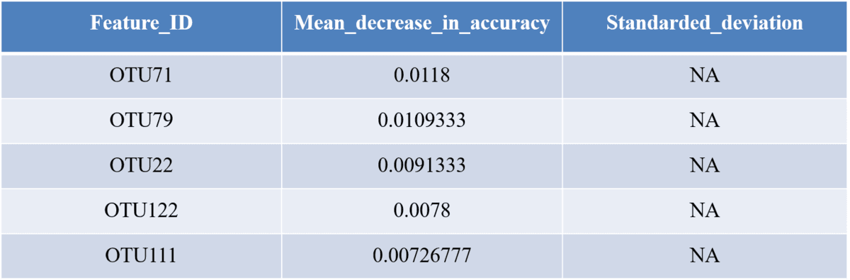
This section shows you how frequently particular genes are identified as top predictors across different iterations of model building, and how much importance they are assigned. Because model building involved a lot of stochasticity, you may find that your top predictors are quite subject to change across iterations.

“`{r, assessing stability of predictors}
set.seed(1)
usefulgenes <- data.frame()
topgenes <- data.frame()
for(i in 1:10) {
model <- randomForest(phenotype ~ ., data=traindata, ntree=10000, mtry=param/10, na.action=na.roughfix)
usefulgenes <- rbind(usefulgenes, cbind(model=i, gene=names(model$importance[model$importance>0,]), model$importance[model$importance>0]))
topgenes <- rbind(topgenes, cbind(model=i, gene=names(model$importance[order(model$importance, decreasing=T),][1:20]), model$importance[order(model$importance, decreasing=T),][1:20]))
}
png(paste(directory, “/gene_usefulnessnew.png”, sep=””))
hist(table(usefulgenes$gene), col=”grey”, main=””, xlab=”Number of times each gene was useful (VI >) in a model”)
dev.off()
sum(table(usefulgenes$gene)==10)
sum(table(usefulgenes$gene)<10)
topgenes$V3 <- as.numeric(as.character(topgenes$V3))
ggplot(topgenes, aes(x=model, y=gene, fill=as.numeric(V3))) + geom_tile() + ggtitle(“Imporance values for top genes across model iterations”) + scale_fill_continuous(“Importance”)
table(topgenes$gene)
png(paste(directory, “/topgenesnew.png”, sep=””))
hist(table(topgenes$gene), col=”grey”, main=””, xlab=”Number of times each gene appeared in the\ntop 20 predictors”)
dev.off()
save(usefulgenes, topgenes, file=paste(directory, “/allgenemodels.Rdata”, sep=””))
“`

This section allows you to look at the COG categories of your top predictor genes, compared to the COG categories in your original training set, to see if any are over-represented.

“`{r, COG analysis}
annotations <- read.delim(paste(directory, “/gproNOG.annotations.tsv”, sep=””), header=F) # matcing annotation file for your chosen model set can be downloaded from http://eggnogdb.embl.de/#/app/downloads
nogs <- read.delim(paste(directory, “/models_used_20ref.tsv”, sep=””), header=F)
nogs[,2] <- sub(“.*NOG\\.”, “”, nogs[,2])
nogs[,2] <- sub(“.meta_raw”, “”, nogs[,2])
info <- annotations[match(nogs[,2], annotations[,2]),]
info$V5 <- as.character(info$V5)
# proportion of each COG catergory that comes up in the top indicators
background <- nogs[match(colnames(traindata), make.names(nogs[,1])),2]
background_COGs <- annotations[match(background, annotations[,2]),5]
library(plyr)
bg_COGs2 <- aaply(as.character(background_COGs), 1, function(i){
if(!is.na(i)) {
if(nchar(i)>1) {
char <- substr(i,1,1)
for(n in 2:nchar(i)) {
char <- paste(char,substr(i,n,n),sep=”.”)
}
return(char)
} else {
return(i)
}
} else{
return(NA)
}
})

background_COGs2 <- unlist(strsplit(bg_COGs2, “[.]”))
predictors <- nogs[match(colnames(train6), make.names(nogs[,1])),2]
predictor_COGs <- annotations[match(predictors, annotations[,2]),5]
p_COGs2 <- aaply(as.character(predictor_COGs), 1, function(i){
if(!is.na(i)) {
if(nchar(i)>1) {
char <- substr(i,1,1)
for(n in 2:nchar(i)) {
char <- paste(char,substr(i,n,n),sep=”.”)
}
return(char)
} else {
return(i)
}
} else{
return(NA)
}
})
predictor_COGs2 <- unlist(strsplit(p_COGs2, “[.]”))
barplot(rbind(table(background_COGs2), table(predictor_COGs2)[match(names(table(background_COGs2)), names(table(predictor_COGs2)))]))
“`

This section allows you to compare the performance of your model predicting true phenotype and a random phenotype.

“`{r, control}
set.seed(2)
control <- traindata
control$phenotype <- sample(traindata$phenotype)
param <- ncol(control)-1
cmodel1 <- randomForest(phenotype ~ ., data=control, ntree=10000, mtry=param/10, na.action=na.roughfix)
cmodel1
png(paste(directory, “/VI_full_control.png”, sep=””), width=400, height=350)
plot(1:param, cmodel1$importance[order(cmodel1$importance, decreasing=T)], xlim=c(1,1000), ylab=”Variable importance”, xlab=”Top genes”)
dev.off()
pdf(paste(directory, “VI_full_control.pdf”, sep=””), width=5, height=5)
plot(1:param, cmodel1$importance[order(cmodel1$importance, decreasing=T)], xlim=c(1,1000), ylab=”Variable importance”, xlab=”Top genes”)
dev.off()
ctrain2 <- control[,match(names(cmodel1$importance[cmodel1$importance[,1]>0,]), colnames(control))]
ctrain2 <- cbind(ctrain2, phenotype=control$phenotype)
param <- ncol(ctrain2)-1
cmodel2 <- randomForest(phenotype ~ ., data=ctrain2, ntree=10000, mtry=param/10, na.action=na.roughfix)
cmodel2
ctrain3 <- ctrain2[,match(names(cmodel2$importance[cmodel2$importance[,1]>quantile(cmodel2$importance[,1], 0.5),]), colnames(ctrain2))]
ctrain3 <- cbind(ctrain3, phenotype=ctrain2$phenotype)
param <- ncol(ctrain3)-1
cmodel3 <- randomForest(phenotype ~ ., data=ctrain3, ntree=10000, mtry=param/10, na.action=na.roughfix)
cmodel3
ctrain4 <- ctrain3[,match(names(cmodel3$importance[cmodel3$importance[,1]>quantile(cmodel3$importance[,1], 0.5),]), colnames(ctrain3))]
ctrain4 <- cbind(ctrain4, phenotype=ctrain3$phenotype)
param <- ncol(ctrain4)-1
cmodel4 <- randomForest(phenotype ~ ., data=ctrain4, ntree=10000, mtry=param/10, na.action=na.roughfix)
cmodel4
ctrain5 <- ctrain4[,match(names(cmodel4$importance[cmodel4$importance[,1]>quantile(cmodel4$importance[,1], 0.5),]), colnames(ctrain4))]
ctrain5 <- cbind(ctrain5, phenotype=ctrain4$phenotype)
param <- ncol(ctrain5)-1
cmodel5 <- randomForest(phenotype ~ ., data=ctrain5, ntree=10000, mtry=param/10, na.action=na.roughfix, proximity=T)
cmodel5
ctrain6 <- ctrain5[,match(names(cmodel5$importance[cmodel5$importance[,1]>quantile(cmodel5$importance[,1], 0.5),]), colnames(ctrain5))]
ctrain6 <- cbind(ctrain6, phenotype=ctrain5$phenotype)
param <- ncol(ctrain6)-1
cmodel6 <- randomForest(phenotype ~ ., data=ctrain6, ntree=10000, mtry=param/10, na.action=na.roughfix, proximity=T)
cmodel6

cmodel6$predicted
names(cmodel6$importance[order(cmodel6$importance[,1], decreasing=T),])[1:10]
# compare votes and phenotypes for the control and real datasets
cbind(cmodel6$votes, control$phenotype, model6$votes, train6$phenotype)

“`

This approach repeats the full model-building process 5 times to see how similar the top predictor genes are.

“`{r, testing the robustness of the top result}
topgenes <- vector()
# picking out the top predictors from the model
for(i in 1:5) {
set.seed(i)
error <- vector()
sparsity <- vector()
for(i in c(1, 10, 50, 250, 500, 1000, 1500, 2000, 5000, 10000)) {
model <- randomForest(phenotype ~ ., data=traindata, ntree=i, na.action=na.roughfix)
error <- c(error, median(model$err.rate))
sparsity <- c(sparsity, (sum(model$importance[,1]<=0))/(ncol(traindata)-1))
}
error2 <- vector()
sparsity2 <- vector()
param <- ncol(control)-1
for(i in c(1, param/10, param/5, param/3, param/2, param)) {
model <- randomForest(phenotype ~ ., data=traindata, ntree=1000, mtry=i, na.action=na.roughfix)
error2 <- c(error2, median(model$err.rate))
sparsity2 <- c(sparsity2, (sum(model$importance[,1]<=0))/(ncol(traindata)-1))
}
train2 <- traindata[,match(names(model$importance[model$importance[,1]>0,]), colnames(traindata))]
train2 <- cbind(train2, phenotype=traindata$phenotype)
error <- vector()
sparsity <- vector()
for(i in c(1, 10, 50, 250, 500, 1000, 1500, 2000, 5000, 10000)) {
model <- randomForest(phenotype ~ ., data=train2, ntree=i, na.action=na.roughfix)
error <- c(error, median(model$err.rate))
sparsity <- c(sparsity, (sum(model$importance[,1]<=0))/(ncol(train2)-1))
}
error2 <- vector()
sparsity2 <- vector()
param <- ncol(control)-1
for(i in c(1, param/10, param/5, param/3, param/2, param)) {
model <- randomForest(phenotype ~ ., data=train2, ntree=20000, mtry=i, na.action=na.roughfix)
error2 <- c(error2, median(model$err.rate))
sparsity2 <- c(sparsity2, (sum(model$importance[,1]<=0))/(ncol(train2)-1))
}
train3 <- train2[,match(names(model$importance[model$importance[,1]>quantile(model$importance[,1], 0.5),]), colnames(train2))]
train3 <- cbind(train3, phenotype=train2$phenotype)
error <- vector()
sparsity <- vector()
for(i in c(1, 10, 50, 250, 500, 1000, 1500, 2000, 5000, 10000)) {
model <- randomForest(phenotype ~ ., data=train3, ntree=i, na.action=na.roughfix)
error <- c(error, median(model$err.rate))
sparsity <- c(sparsity, (sum(model$importance[,1]<=0))/(ncol(train3)-1))
}
error2 <- vector()
sparsity2 <- vector()
param <- ncol(control)-1
for(i in c(1, param/10, param/5, param/3, param/2, param)) {
model <- randomForest(phenotype ~ ., data=train3, ntree=2000, mtry=i, na.action=na.roughfix)
error2 <- c(error2, median(model$err.rate))
sparsity2 <- c(sparsity2, (sum(model$importance[,1]<=0))/(ncol(train3)-1))
}
train4 <- train3[,match(names(model$importance[model$importance[,1]>quantile(model$importance[,1], 0.5),]), colnames(train3))]
train4 <- cbind(train4, phenotype=train3$phenotype)
topgenes <- c(topgenes, colnames(train4))
}
table(topgenes)

微生物多样研究—差异分析

1. 随机森林模型

随机森林是一种基于决策树(Decisiontree)的高效的机器学习算法,可以用于对样本进行分类(Classification),也可以用于回归分析(Regression)。

它属于非线性分类器,因此可以挖掘变量之间复杂的非线性的相互依赖关系。通过随机森林分析,可以找出能够区分两组样本间差异关键OTU。

Feature Importance Scores表格-来源于随机森林结果

记录了各OTU对组间差异的贡献值大小。

18585978-a855cbdb5a069bb1

注:一般地,选取Mean_decrease_in_accuracy值大于0.05的OTU,作进一步分析;对于组间差异较小的样本,该值可能会降至0.03。

2. 交叉验证分析

交叉验证(Crossvalidation),是一种统计学上将数据样本切割成较小子集的实用方法。先在一个子集上做分析,而其它子集则用来做后续对此分析的确认及验证。一开始的子集被称为训练集。而其它的子集则被称为验证集或测试集。

其中最常见的为k-foldercross-validation,它指的是将所有数据分成k个子集,每个子集均做一次测试集,其余的作为训练集。交叉验证重复k次,每次选择一个子集作为测试集,并将k次的平均交叉验证识别正确率作为结果。

所有的样本都被作为了训练集和测试集,每个样本都被验证一次。

对随机森林方法筛选出的关键OTU的组合进行遍历,以期用最少的OTU数目组合构建一个错误率最低高效分类器。

一般地,对随机森林分析筛选出的关键OTU,按照不同组合进行10倍交叉验证分析,找出能够最准确区分组间差异的最少的OTU组合,再做进一步的分析,如ROC分析等。

注:图中横坐标表示不同数量的OTU组合,纵坐标表示该数量OTU组合下分类的错误率。OTU组合数越少,且错误率越低,则该OTU组合被认为是能够区分组间差异的最少的OTU组合。

3. ROC曲线

接收者操作特征曲线(Receiveroperating characteristic curve,ROC 曲线)也是一种有效的有监督学习方法。ROC分析属于二元分类算法,用来处理只有两种分类的问题,可以用于选择最佳的判别模型,选择最佳的诊断界限值。

可依据专业知识,对疾病组和参照组测定结果进行分析,确定测定值的上下限、组距以及截断点(cut-offpoint),按选择的组距间隔列出累积频数分布表,分别计算出所有截断点的敏感性(Sensetivity)、特异性和假阳性率(1-特异性:Specificity)。以敏感性为纵坐标代表真阳性率,(1-特异性)为横坐标代表假阳性率,作图绘成ROC曲线。ROC曲线越靠近左上角,诊断的准确性就越高。亦可通过分别计算各个试验的ROC曲线下的面积(AUC)进行比较,哪一种试验的AUC最大,则哪一种试验的诊断价值最佳。

18585978-07a26b63fea21bf8

注:图中横坐标为假阳性率false positive rate(FPR):Specificity,纵坐标为真阳性率true positive rate(TPR):Sensetivity。最靠近左上角的ROC曲线的点是错误最少的最好阈值,其假阳性和假阴性的总数最少。ROC曲线下的面积值在1.0和0.5之间。在AUC>0.5的情况下,AUC越接近于1,说明诊断效果越好。AUC在 0.5~0.7时有较低准确性,AUC在0.7~0.9时有一定准确性,AUC在0.9以上时有较高准确性。AUC=0.5时,说明诊断方法完全不起作用,无诊断价值。AUC<0.5不符合真实情况,在实际中极少出现。

4. Wilcoxon秩和检验分析

Wilcoxonrank-sum test,也叫曼-惠特尼U检验(Mann–WhitneyU test),是两组独立样本非参数检验的一种方法。其原假设为两组独立样本来自的两总体分布无显著差异,通过对两组样本平均秩的研究来实现判断两总体的分布是否存在差异,该分析可以对两组样品的物种进行显著性差异分析,并对p值计算假发现率(FDR)q值。

18585978-6714c4d277105abd

注:mean分别为两组样品物种的平均相对丰度,sd分别是两组样本物种相对丰度的标准差。P值为对两组检验原假设为真的概率值,p<0.05表示存在差异,p<0.01表示差异显著,q值为假发现率。

5. 差异菌群Heatmap分析

以10倍交叉验证(10-foldcross-validation)估计泛化误差(Generalizationerror)的大小,其余参数使用默认设置。建模结果同时包含“基线”误差(Baselineerror)的期望值,即数据集中属于最优势分类的样本全部被错误分类的概率。每个OTU根据其被移除后模型预报错误率增加的大小确定其重要度数值,重要度越高,该OTU对模型预报准确率的贡献越大。

根据挑选出来的差异OTU,根据其在每个样品中的丰度信息,对物种进行聚类,绘制成热图,便于观察哪些物种在哪些样品中聚集较多或含量较低。

18585978-391e366b1420fa92

注:图中越接近蓝色表示物种丰度越低,越接近橙红色表示丰度越高。左边的聚类树是根据各物种间的spearman相关性距离进行聚类;上边的聚类树是采用样本间距离算法中最常用的Bray-Curtis算法进行聚类。

6. 两组样本Welch’s t-test分析

两组不同方差的样本可使用Welch’st-test进行差异比较分析,通过此分析可获得在两组中有显著性差异的物种[或差异基因丰度—适用于元(宏)基因组]。

18585978-8453377e0336274c

注:上图所示为不同基因丰度(或物种)在两组样品中的丰度比例,中间所示为95%置信度区间内,物种丰度的差异比例,最右边的值为p值,p值<0.05,表示差异显著。

7. Shannon多样性指数比较盒状图

将不同分类或环境的多组样本的Shannon多样性指数进行四分位计算,比较不同样本组的组间Shannon指数差异。同时进行非参数Mann-Whitney判断样本组间的显著性差异

18585978-5c097b33070b52e3

注:横坐标表示样本分组,纵坐标表示相对应的Alpha多样性指数值;图形可以显示5个统计量(最小值,第一个四分位,中位数,第三个中位数和最大值,及由下到上5条线)。p<0.05,表示差异显著;P<0.01,表示差异极显著。

8. 基于距离的箱式图

将不同分类或环境的多组样本的距离进行四分位计算,比较不同样本组的组内和组间的距离分布差异。同时进行multipleStudent’s two-sample t-tests判断样本组间差异的显著性。

箱式图的作用:识别数据异常值;粗略估计和判断数据特征;比较几批数据的形状,同一数轴上,几批数据的箱形图并行排列,几批数据的中位数、尾长、异常值、分布区间等形状信息一目了然。

箱线图(Boxplot)也称箱须图(Box-whiskerPlot),是利用数据中的五个统计量:最小值、第一四分位数、中位数、第三四分位数与最大值来描述数据的一种方法,它也可以粗略地看出数据是否具有对称性,分布的分散程度等信息,特别可以用于对几组样本的比较。简单箱线图由五部分组成,分别是最小值、中位数、最大值和两个四分位数。

18585978-1605130e5d641edc

注:第一四分位数 (Q1),又称“下四分位数”,等于该样本中所有数值由小到大排列后第25%的数字。第二四分位数 (Q2),又称“中位数”,等于该样本中所有数值由小到大排列后第50%的数字。 第三四分位数 (Q3),又称“上四分位数”,等于该样本中所有数值由小到大排列后第75%的数字。

9. LEfSe分析

LEfSe是一种用于发现高维生物标识和揭示基因组特征的软件。包括基因,代谢和分类,用于区别两个或两个以上生物条件(或者是类群)。该算法强调的是统计意义和生物相关性。让研究人员能够识别不同丰度的特征以及相关联的类别。

LEfSe通过生物学统计差异使其具有强大的识别功能。然后,它执行额外的测试,以评估这些差异是否符合预期的生物学行为。

具体来说,首先使用non-parametric factorial Kruskal-Wallis (KW) sum-rank test(非参数因子克鲁斯卡尔—沃利斯和秩验检)检测具有显著丰度差异特征,并找到与丰度有显著性差异的类群。最后,LEfSe采用线性判别分析(LDA)来估算每个组分(物种)丰度对差异效果影响的大小。

18585978-9453e2fea01fb73b

说明:左边的图为统计两个组别当中有显著作用的微生物类群通过LDA分析(线性回归分析)后获得的LDA分值。右边的图为聚类树,节点大小表示丰度,默认从门到属依次向外排列。红色区域和绿色区域表示不同分组,树枝中红色节点表示在红色组别中起到重要作用的微生物类群,绿色节点表示在绿色组别中起到重要作用的微生物类群,黄色节点表示的是在两组中均没有起到重要作用的微生物类群。图中英文字母表示的物种名称在右侧图例中进行展示。

10. ANOSIM相似性分析

相似性分析(ANOSIM)是一种非参数检验,用来检验组间(两组或多组)的差异是否显著大于组内差异,从而判断分组是否有意义。首先利用Bray-Curtis算法计算两两样品间的距离,然后将所有距离从小到大进行排序,按以下公式计算R值,之后将样品进行置换,重新计算R*值,R*大于R的概率即为P值。

18585978-e0960fa6644a18ff

其中,

r ̅ _b:表示组间(Between groups)距离排名的平均值;

r ̅ _w:表示组内(Within groups)距离排名的平均值;

n:表示样品总数。

Table. Anosimanalysis

18585978-d456795bc0cddde8

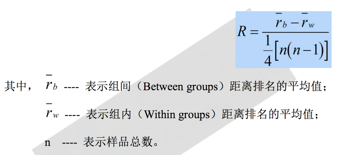
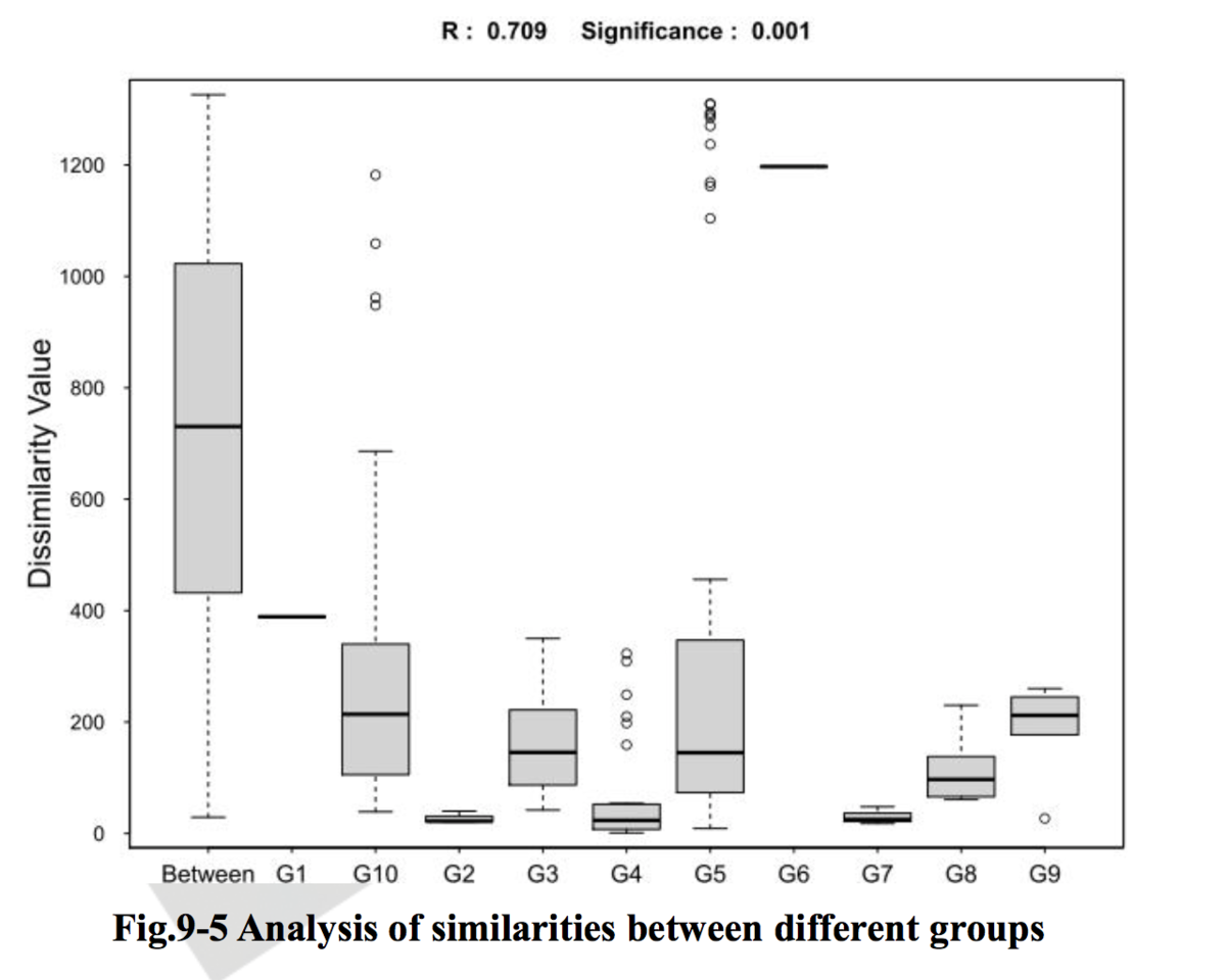
注:理论上,R值范围为-1到+1,实际中R值一般从0到1,R值接近1表示组间差异越大于组内差异,R值接近0则表示组间和组内没有明显差异。P值则反映了分析结果的统计学显著性,P值越小,表明各样本分组之间的差异显著性越高,P< 0.05表示统计具有显著性;Number of permutation表示置换次数。

11. Adonis多因素方差分析

Adonis又称置换多因素方差分析(permutationalMANOSVA)或非参数多因素方差分析(nonparametricMANOVA)。它利用半度量(如Bray-Curtis)或度量距离矩阵(如Euclidean)对总方差进行分解,分析不同分组因素对样品差异的解释度,并使用置换检验对划分的统计学意义进行显著性分析。

Table permutational MANOVA analysis

18585978-7fa68baa52da9d13

注:

Group:表示分组;

Df:表示自由度;

SumsOfSqs:总方差,又称离差平方和;

MeanSqs:平均方差,即SumsOfSqs/Df;

F.Model:F检验值;

R2:表示不同分组对样品差异的解释度,即分组方差与总方差的比值,即分组所能解释的原始数据中差异的比例,R2越大表示分组对差异的解释度越高;

Pr(>F):通过置换检验获得的P值,P值越小,表明组间差异显著性越强。

作者:JarySun
链接:https://www.jianshu.com/p/87f24cceaa43
来源:简书
著作权归作者所有。商业转载请联系作者获得授权,非商业转载请注明出处。

ANOSIM,PERMANOVA/Adonis,MRPP (转贴)

6634703-6fde5e9bfb6489c7

1. ANOSIM 组间相似性分析

  • 相似性分析(ANOSIM)是一种非参数检验,用来检验组间(两组或多组)的差异是否显著大于组内差异,从而判断分组是否有意义。首先利用 Bray-Curtis 算法计算两两样品间的距离,然后将所有距离从小到大进行排序, 按以下公式计算 R 值,之后将样品进行置换,重新计算 R值,R大于 R 的概率即为 P 值。

6634703-ec94fa34c56b542a6634703-01bd752421e6028e

注:图上总共有 N+1 个盒子,N 为分组数量。“Between”的盒子指代的是分组之间的差异,其他分别代表各自组 内差异。R 值范围为-1 到+1,实际中 R 值一般从 0 到 1。R 值接近 1 表示组间差异越大于组内差异,R 值接近 0 则表示组间和组内没有明显差异;此次统计分析的可信度用 P-value 表示,P< 0.05 表示统计具有显著性。

2. PERMANOVA/Adonis 置换多元方差分析

PERMANOVA (Permutational multivariate analysis of variance,置换多元方差分析),又称 Adonis 分析,可利用半度量(如 Bray-Curtis)或度量距离矩阵(如 Euclidean)对总方差进行分解,通过线性模型分析不同分组因素 或环境因子(如临床表型数据、土壤理化指标等)对样品差异的解释度,并使用置换检验进行显著性分析。

6634703-73376c3dc4dfb5406634703-cf2b6e7dd53c0843

3. MRPP 多响应置换过程分析

MRPP 分析(Multiple Response Permutation Procedure,MRPP)用来检验组间(两组或多组)的差异是否显著大于组内差异。与 ANOSIM 分析类似,可利用半度量(如 Bray-Curtis)或度量距离矩阵(如 Euclidean)计算 A 值表示组间差异,使用置换检验对分组进行显著性分析。

6634703-296b421d3f08ae04

Adonis与ANOSIM检验究竟是什么?(转贴)

做微生物16S测序的时候,公司的报告里经常会给到两种检验Adonis和ANOSIM,听过t.test、wilicox、anova各种检验,那么Adonis和ANOSIM检验是什么呢

Adonis 多元方差分析

Adonis,多元方差分析,亦可称为非参数多元方差分析。其原理是利用距离矩阵(比如基于Bray-Curtis距离、Euclidean距离)对总方差进行分解,分析不同分组因素对样品差异的解释度,并使用置换检验对其统计学意义进行显著性分析

Adonis分析结果通常如下:

Index Df SumsOfSqs MeanSqs F.Model R2 Pr(>F)
GroupFactor 4 1.0899 0.27248 1.4862 0.14883 0.011
Residuals 34 6.2335 0.18334 0.85117
Total 38 7.3234 1.00000

其中,GroupFactor表示实验中的分组方法
Df表示自由度
SumsOfSqs表示总方差即离差平方和
MeanSqs表示均方差(SumsOfSeqs/Df)
F.Model表示检验值F
R2表示该分组方式对样品间差异的解释度,R2越大说明该分组方案对差异的解释度越高
Pr表示P值,小于0.05时显著说明本次检验的可信度高。

那么Adonis具体要如何使用呢?
在微生物的分析中我们通常把Adonis和PCA分析结合在一起。进行完PCA分析后,我们想要检验不同的分组之间究竟是否有差异,差异是否显著,这时候我们就可以用Adonis检验。如下图,虽然我们可以看到三组被分开了,但是这种分开真的显著吗?这种分组又能对样本的差异解释多少呢?那么右侧的Adonis检验就告诉了我们明确的答案,这种分组时显著的,R2=0.11。

8637066-0eb31addfe19bebe

Sylvain I A, Adams R I, Taylor J W. A different suite: The assemblage of distinct fungal communities in water-damaged units of a poorly-maintained public housing building[J]. PloS one, 2019, 14(3): e0213355.

在R中我们可以使用Vegan包中的函数adonis()adonis2()进行adonis检验。

adonis2(formula, data, permutations = 999, method = "bray",
    sqrt.dist = FALSE, add = FALSE, by = "terms",
    parallel = getOption("mc.cores"), ...)

adonis(formula, data, permutations = 999, method = "bray",
    strata = NULL, contr.unordered = "contr.sum",
    contr.ordered = "contr.poly", parallel = getOption("mc.cores"), ...)

ANOSIM 相似性分析

ANOSIM,相似性分析是一种非参数检验,用于检验高纬度数据间的相似性,比较组间和组内差异的大小,从而判断分组是否有意义,其可以用于检验两组的组间和组内差异,也可以用于多组。

ANOSIM的原理如下,以最基本的两个组为例:
现在一共有6个样本,根据我们的实验方案将其分为两组Group1和Group2,每组含有3个样本。

1、首先我们基于组内样本间的距离计算组内的相似性。

8637066-4c0d4a9ee6608c0d

2、然后我们基于组间样本的距离计算组间的相似性。
8637066-3b4b1374ba6a6743
结合组内和组间,得到:
8637066-8d5c1d0cd703fe77

然后我们根据公式计算R值:

8637066-b3c9bd5383539d8c

其中,
r0= mean rank of between group dissimilarities 即组间差异性秩的平均值
rw= mean rank of within group dissimilarities 即组内差异性秩的平均值
n=the number of samples 即样本总数量

因此根据公式可以知道,R的取值范围为[-1,1]:
当R趋向于1时,说明组间差异大于组内差异
当R=0时,说明组间没有差异,即分组无效,不同分组之间没有差异。
当R趋向于-1时,说明组间差异小于组内差异。

当R大于0时,我们还要进一步检验这种差异是否显著具有可信度,ANOSIM中对其的检验方法也是使用Permutation Test即置换检验。

置换检验:1、对原始样本进行随机分组,分为实验组和对照组
2、计算随机分组的Ri值,并和R比较
3、重复1000次
4、计算p=Ri大于R的百分比,从而计算P值

在我们做完PCoA、NMDS等降维分析的时候,我们也会遇到一同样的问题,数据看起来是分开的,但是不同的组之间差异真的显著吗?这个时候也可以选择ANOSIM进行检验。

R中Vegan包也提供了ANOSIM检验。下面用R中自带的鸢尾花数据集(iris)做一个示范:

library(vegan)
library(ggplot2)
#Delete Species Infor
dat<-subset(iris,select = -Species)
#Calculate Distance
iris.dist<-vegdist(dat)
#MDS analysis
m<-monoMDS(iris.dist)
MDS<-as.data.frame(m$points)
#Gain group information
MDS$group<-iris$Species
#Plot
p<-ggplot(MDS,aes(MDS1,MDS2,col=group,shape=group))+
  geom_point()+
  theme_bw()+
  theme(legend.title=element_blank())
8637066-6be283f0b46d2616
从上图我们可以直观地看出,组间差异大于组内差异,三组样本明显可以分开。
 那么进一步我们用ANOSIM检验来验证我们从图中得到的结论。
#ANOSIM
anosim_result<-anosim(dat,iris$Species,permutations = 999)
summary(anosim_result)
plot(anosim_result, col = c('#FFD700','#FF7F00','#EE2C2C','#D02090'))
8637066-402a68df1c328084
8637066-8e1374dca1a6ff46
从上图可以直观看到组间差异大于组内差异,R=0.858,接近于1,P值为0.001,小于0.05,说明该不同的分组之间差异明显,该分组是有意义的。

作者:jlyq617
链接:https://www.jianshu.com/p/dfa689f7cafd
来源:简书

Docker + Trojan + Caddy 部署 ( 转贴)

SourceURL:https://muguang.me/it/2757.html

Docker + Trojan + Caddy 部署

关于 Trojan,不要多问,问就是代理工具。它先进的地方在于,数据传输使用 TLS 协议,伪装成 HTTPS 请求。Trojan 服务端监听 443 端口,对于普通来路的请求,会交由 Web 服务器处理,返回 Web 网站;而对于 Trojan 客户端来的请求,则由 Trojan 服务端进行代理。这跟 某2ray + Websocket + TLS 原理是一样的,都是通过伪装流量,避免被提取特征或是被检测。

这篇文章里,我将使用 Ubuntu 18.04 操作系统,使用 Caddy 作为 Web 服务器,将 Trojan 服务端和 Caddy 部署到 Docker 中。

0、准备

  • 域名 x1
  • 国外服务器 x1

部署前先给域名设置一条 A 记录,并指向你的服务器 IP。

1、安装 Docker & Docker-Compose

  • 添加 Docker 软件源
    sudo apt-get update
    sudo apt-get install apt-transport-https ca-certificates  curl software-properties-common
    curl -fsSL https://mirrors.ustc.edu.cn/docker-ce/linux/ubuntu/gpg | sudo apt-key add -
    sudo add-apt-repository "deb [arch=amd64] https://mirrors.ustc.edu.cn/docker-ce/linux/ubuntu $(lsb_release -cs) stable"
    
    Shell
  • 安装 Docker CE(社区版)
    sudo apt-get update -y
    sudo apt-get install docker-ce -y
    Shell
  • 安装 Docker-compose 容器编排工具
    sudo curl -L https://github.com/docker/compose/releases/download/1.18.0/docker-compose-`uname -s`-`uname -m` -o /usr/local/bin/docker-compose
    sudo chmod +x /usr/local/bin/docker-compose
    docker-compose --version
    Shell

2、构建 Trojan + Caddy 镜像

我已经写好了 Docker compose 的构建脚本,直接克隆下来用即可。

  • 下载 Trojan + Caddy 构建配置,见 GitHub
    git clone git@github.com:FaithPatrick/trojan-caddy-docker-compose.git trojan-caddy-docker-compose && cd trojan-caddy-docker-compose
    Shell
  • 编辑 ./caddy/Caddyfile
    www.yourdomain.com:80 {
        root /usr/src/trojan
        log /usr/src/caddy.log
        index index.html
    }
    
    www.yourdomain.com:443 {
        root /usr/src/trojan
        log /usr/src/caddy.log
        index index.html
    }
    Caddyfile

    www.yourdomain.com 替换成事先准备的域名。

  • 编辑 ./trojan/config/config.json
    config:json:8 位置,将 your_password 替换成要设置的密码,这是客户端需要用到的密码,妥善保管。

    config:json:12-13 位置将 your_domain_name 替换成自己的域名, 这个路径是 Caddy 自动调用 Let’s encrypt 生成的证书路径。

    • 执行 docker-compose build 构建镜像,如果没什么报错就代表成功了。

3、运行 Trojan + Caddy 容器

执行 docker-compose up 命令启动容器,正常启动的日志应该看起来是这样的:

➜ docker-compose up

Starting test_caddy_1 ... done
Attaching to test_caddy_1
caddy_1  | Activating privacy features...
caddy_1  |
caddy_1  | Your sites will be served over HTTPS automatically using Let's Encrypt.
caddy_1  | By continuing, you agree to the Let's Encrypt Subscriber Agreement at:
caddy_1  |   https://letsencrypt.org/documents/LE-SA-v1.2-November-15-2017.pdf
caddy_1  | Please enter your email address to signify agreement and to be notified
caddy_1  | in case of issues. You can leave it blank, but we don't recommend it.
caddy_1  |   Email address: 2020/01/10 13:54:58 [INFO] acme: Registering account for
caddy_1  | 2020/01/10 13:54:58 [INFO][xx.xx.xx] acme: Obtaining bundled SAN certificate
caddy_1  | 2020/01/10 13:54:58 [INFO][xx.xx.xx] AuthURL: https://acme-v02.api.letsencrypt.org/acme/authz-v3/xxxxxx
caddy_1  | 2020/01/10 13:54:58 [INFO][xx.xx.xx] acme: Trying to solve HTTP-01
caddy_1  | 2020/01/10 13:54:58 [INFO][xx.xx.xx] Served key authentication
caddy_1  | 2020/01/10 13:55:03 [INFO][xx.xx.xx] The server validated our request
caddy_1  | 2020/01/10 13:55:03 [INFO][xx.xx.xx] acme: Validations succeeded; requesting certificates
caddy_1  | 2020/01/10 13:55:04 [INFO][xx.xx.xx] Server responded with a certificate.
caddy_1  | 2020/01/10 13:55:04 [INFO][xx.xx.xx] Certificate written to disk: /root/.caddy/acme/acme-v02.api.letsencrypt.org/sites/xx.xx.xx/xx.xx.xx.crt
caddy_1  | done.

Starting test_trojan_1 ... done
Attaching to test_caddy_1, test_trojan_1
trojan_1  | ssl certs is empty - checking...
trojan_1  | Welcome to trojan 1.14.0
trojan_1  | [2020-01-10 15:40:58] [WARN] trojan service (server) started at 0.0.0.0:443
Shell

如果想常驻进程,启动容器时执行 docker-compose up -d

用浏览器访问 https://域名 看一下返回,我的构建脚本默认会返回 Bootstrap 的起始页面:

20200111012712.png

网站存放在 ./wwwroot/trojan/ 目录下面 ,可以随便放点什么,尽可能像一个正常网站就好。

至此,Docker + Trojan + Caddy 服务端部署完成。

4、Trojan 客户端

不多提了,Windows 和 macOS 客户端官方仓库都有:https://url.cn/5r6mb9J
当然,你也可以去寻找更易用的支持 Trojan 的第三方客户端或路由器固件。